渲染器和属性(2)
现在,对于iOS,EllipseUIView类是存在的,可以使用EllipseUIView作为本机控件来编写EllipseViewRenderer。 从结构上讲,这个类几乎与Windows渲染器相同:
using System.ComponentModel;
using UIKit;
using Xamarin.Forms;
using Xamarin.Forms.Platform.iOS;
[assembly: ExportRenderer(typeof(Xamarin.FormsBook.Platform.EllipseView),
                                 typeof(Xamarin.FormsBook.Platform.iOS.EllipseViewRenderer))]
namespace Xamarin.FormsBook.Platform.iOS
{
    public class EllipseViewRenderer : ViewRenderer<EllipseView, EllipseUIView>
    {
        protected override void OnElementChanged(ElementChangedEventArgs<EllipseView> args)
        {
            base.OnElementChanged(args);
            if (Control == null)
            {
                SetNativeControl(new EllipseUIView());
            }
            if (args.NewElement != null)
            {
                SetColor();
            }
        }
        protected override void OnElementPropertyChanged(object sender,
                                                         PropertyChangedEventArgs args)
        {
            base.OnElementPropertyChanged(sender, args);
            if (args.PropertyName == EllipseView.ColorProperty.PropertyName)
            {
                SetColor();
            }
        }
        void SetColor()
        {
            if (Element.Color != Color.Default)
            {
                Control.SetColor(Element.Color.ToUIColor());
            }
            else
            {
                Control.SetColor(UIColor.Clear);
            }
        }
    }
}
此渲染器和Windows版本之间唯一的真正区别是Control属性设置为ColorUIView的实例,底部的SetColor方法的主体是不同的。 它现在调用ColorUIView中的SetColor方法。 这个SetColor方法也可以在名为ToUIColor的Xamarin.Forms.Platform.iOS库中使用公共扩展方法
将Xamarin.Forms颜色转换为iOS颜色。
您可能已经注意到,Windows渲染器和iOS渲染器都不必担心调整大小。 您很快就会看到,EllipseView可以设置为各种大小,并且在Xamarin.Forms布局系统中计算的大小将变为本机控件的大小。
遗憾的是,这不是Android渲染器的情况。 Android渲染器需要一些大小调整逻辑。 与iOS一样,Android也缺少呈现椭圆的本机控件。 因此,Xamarin.FormsBook.Platform.Android库包含一个名为EllipseDrawableView的类,它从View派生并绘制一个椭圆:
using Android.Content;
using Android.Views;
using Android.Graphics.Drawables;
using Android.Graphics.Drawables.Shapes;
using Android.Graphics;
namespace Xamarin.FormsBook.Platform.Android
{
    public class EllipseDrawableView : View
    {
        ShapeDrawable drawable;
        public EllipseDrawableView(Context context) : base(context)
        {
            drawable = new ShapeDrawable(new OvalShape());
        }
        protected override void OnDraw(Canvas canvas)
        {
            base.OnDraw(canvas);
            drawable.Draw(canvas);
        }
        public void SetColor(Xamarin.Forms.Color color)
        {
            drawable.Paint.SetARGB((int)(255 * color.A),
                                   (int)(255 * color.R),
                                   (int)(255 * color.G),
                                   (int)(255 * color.B));
            Invalidate();
        }
        public void SetSize(double width, double height)
        {
            float pixelsPerDip = Resources.DisplayMetrics.Density;
            drawable.SetBounds(0, 0, (int)(width * pixelsPerDip),
                                     (int)(height * pixelsPerDip));
            Invalidate();
        }
    }
}
在结构上,这类似于为iOS定义的EllipseUIView类,除了构造函数为椭圆创建一个ShapeDrawable对象,并且OnDraw覆盖渲染它。
此类有两种方法来设置此椭圆的属性。 SetColor方法转换Xamarin.Forms颜色以设置ShapeDrawable对象的Paint属性,SetSize方法将设备无关单位的大小转换为像素,用于设置ShapeDrawable对象的边界。 SetColor和SetSize都以对Invalidate的调用结束,以使绘图表面无效并生成对OnDraw的另一个调用。
Android渲染器使用EllipseDrawableView类作为其本机对象:
using System.ComponentModel;
using Xamarin.Forms;
using Xamarin.Forms.Platform.Android;
[assembly: ExportRenderer(typeof(Xamarin.FormsBook.Platform.EllipseView),
                          typeof(Xamarin.FormsBook.Platform.Android.EllipseViewRenderer))]
namespace Xamarin.FormsBook.Platform.Android
{
    public class EllipseViewRenderer : ViewRenderer<EllipseView, EllipseDrawableView>
    {
        double width, height;
        protected override void OnElementChanged(ElementChangedEventArgs<EllipseView> args)
        {
            base.OnElementChanged(args);
            if (Control == null)
            {
                SetNativeControl(new EllipseDrawableView(Context));
            }
            if (args.NewElement != null)
            {
                SetColor();
                SetSize();
            }
        }
        protected override void OnElementPropertyChanged(object sender,
                                                         PropertyChangedEventArgs args)
        {
            base.OnElementPropertyChanged(sender, args);
            if (args.PropertyName == VisualElement.WidthProperty.PropertyName)
            {
                width = Element.Width;
                SetSize();
            }
            else if (args.PropertyName == VisualElement.HeightProperty.PropertyName)
            {
                height = Element.Height;
                SetSize();
            }
            else if (args.PropertyName == EllipseView.ColorProperty.PropertyName)
            {
                SetColor();
            }
        }
        void SetColor()
        {
            Control.SetColor(Element.Color);
        }
        void SetSize()
        {
            Control.SetSize(width, height);
        }
    }
}
请注意,OnElementPropertyChanged方法需要检查Width和Height属性的更改并将它们保存在字段中,以便可以将它们组合到SetSize调用EllipseDrawableView的单个Bounds设置中。
所有渲染器到位后,是时候看它是否有效。 EllipseDemo解决方案还包含指向Xamarin.FormsBook.Platform解决方案的各个项目的链接,EllipseDemo中的每个项目都包含对Xamarin.FormsBook.Platform中相应库项目的引用。
EllipseDemo中的每个项目还包含对相应库项目中的Toolkit.Init方法的调用。这并不总是必要的。但请记住,各种渲染器不会被任何项目中的任何代码直接引用,并且某些优化可能导致代码在运行时无法使用。对Toolkit.Init的调用避免了这种情况。
EllipseDemo中的XAML文件创建了几个具有不同颜色和大小的EllipseView对象,其中一些受到大小限制,而其他对象则允许填充其容器:
<?xml version="1.0" encoding="utf-8" ?>
<ContentPage xmlns="http://xamarin.com/schemas/2014/forms"
xmlns:x="http://schemas.microsoft.com/winfx/2009/xaml"
xmlns:platform=
"clr-namespace:Xamarin.FormsBook.Platform;assembly=Xamarin.FormsBook.Platform"
x:Class="EllipseDemo.EllipseDemoPage">
<Grid>
<platform:EllipseView Color="Aqua" />
<StackLayout>
<StackLayout.Padding>
<OnPlatform x:TypeArguments="Thickness"
iOS="0, 20, 0, 0" />
</StackLayout.Padding>
<platform:EllipseView Color="Red"
WidthRequest="40"
HeightRequest="80"
HorizontalOptions="Center" />
<platform:EllipseView Color="Green"
WidthRequest="160"
HeightRequest="80"
HorizontalOptions="Start" />
<platform:EllipseView Color="Blue"
WidthRequest="160"
HeightRequest="80"
HorizontalOptions="End" />
<platform:EllipseView Color="#80FF0000"
HorizontalOptions="Center" />
<ContentView Padding="50"
VerticalOptions="FillAndExpand">
<platform:EllipseView Color="Red"
BackgroundColor="#80FF0000" />
</ContentView>
</StackLayout>
</Grid>
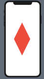
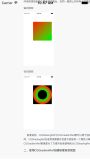
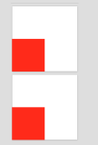
</ContentPage>请特别注意倒数第二个EllipseView,它给自己一个半透明的红色。 对于填充页面的大椭圆的Aqua,这应该呈现为中灰色。
最后一个EllipseView为自己提供半透明红色的BackgroundColor设置。 同样,这应该在大的Aqua椭圆上呈灰色,但在白色背景下呈浅红色,在黑色背景下呈暗红色。 他们来了:
一旦你有一个EllipseView,当然你会想要写一个弹跳球程序。 BouncingBall解决方案还包含指向Xamarin.FormsBook.Platform解决方案中所有项目的链接,并且所有应用程序项目都引用了相应的库项目。 BouncingBall PCL还引用了一个名为Vector2的结构的Xamarin.FormsBook.Toolkit库,这是一个二维向量。
XAML文件将EllipseView定位在页面的中心:
<ContentPage xmlns="http://xamarin.com/schemas/2014/forms"
             xmlns:x="http://schemas.microsoft.com/winfx/2009/xaml"
             xmlns:platform=
                 "clr-namespace:Xamarin.FormsBook.Platform;assembly=Xamarin.FormsBook.Platform"
             x:Class="BouncingBall.BouncingBallPage">
    <platform:EllipseView x:Name="ball"
                          WidthRequest="100"
                          HeightRequest="100"
                          HorizontalOptions="Center"
                          VerticalOptions="Center" />

</ContentPage>
代码隐藏文件启动了两个“永远”运行的动画。第一个动画在构造函数中定义,并动画弹跳球的Color属性,每隔10秒通过彩虹的颜色。
第二个动画在屏幕的四个“墙壁”上弹回球。 对于通过while循环的每个循环,代码首先确定它将首先击中哪个墙以及以与设备无关的单位到该墙的距离。 朝向while循环结束的中心的新计算是球撞击墙壁时的位置。 新的矢量计算基于现有矢量和垂直于其击中的表面的矢量(称为法向矢量)确定偏转矢量:
public partial class BouncingBallPage : ContentPage
{
public BouncingBallPage()
{
InitializeComponent();
// Color animation: cycle through rainbow every 10 seconds.
new Animation(callback: v => ball.Color = Color.FromHsla(v, 1, 0.5),
start: 0,
end: 1
).Commit(owner: this,
name: "ColorAnimation",
length: 10000,
repeat: () => true);
BounceAnimationLoop();
}
async void BounceAnimationLoop()
{
// Wait until the dimensions are good.
while (Width == -1 && Height == -1)
{
await Task.Delay(100);
}
// Initialize points and vectors.
Point center = new Point();
Random rand = new Random();
Vector2 vector = new Vector2(rand.NextDouble(), rand.NextDouble());
vector = vector.Normalized;
Vector2[] walls = { new Vector2(1, 0), new Vector2(0, 1), // left, top
new Vector2(-1, 0), new Vector2(0, -1) }; // right, bottom
while (true)
{
// The locations of the four "walls" (taking ball size into account).
double right = Width / 2 - ball.Width / 2;
double left = -right;
double bottom = Height / 2 - ball.Height / 2;
double top = -bottom;
// Find the number of steps till a wall is hit.
double nX = Math.Abs(((vector.X > 0 ? right : left) - center.X) / vector.X);
double nY = Math.Abs(((vector.Y > 0 ? bottom : top) - center.Y) / vector.Y);
double n = Math.Min(nX, nY);
// Find the wall that's being hit.
Vector2 wall = walls[nX < nY ? (vector.X > 0 ? 2 : 0) : (vector.Y > 0 ? 3 : 1)];
// New center and vector after animation.
center += n * vector;
vector -= 2 * Vector2.DotProduct(vector, wall) * wall;
// Animate at 3 msec per unit.
await ball.TranslateTo(center.X, center.Y, (uint)(3 * n));
}
}
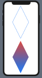
}当然,静态照片无法捕捉到动画的激动人心的动作: