1. 前言
Fall Creators Update中提供了一个新得ColorPicker控件,解决了以前选择颜色只能用Combo Box的窘境。
2. 一个简单的例子
<ColorPicker x:Name="ColorPicker"
             Margin="5" />

<Grid Margin="5">
    <Grid.Background>
        <SolidColorBrush Color="{x:Bind ColorPicker.Color, Mode=OneWay}" />
    </Grid.Background>
    <TextBlock Text="{x:Bind ColorPicker.Color}" />
</Grid>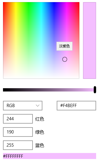
如上所示,ColorPiker可以通过在光谱或色轮上拖动滑块,或者在RGB/HSV及十六进制的TextBox中直接输入颜色的数值改变Color属性。
3. 定制ColorPicker
ColorPicker提供了很多属性以设置它的外观,下面介绍一些常用的属性。
3.1 ColorSpectrumShape
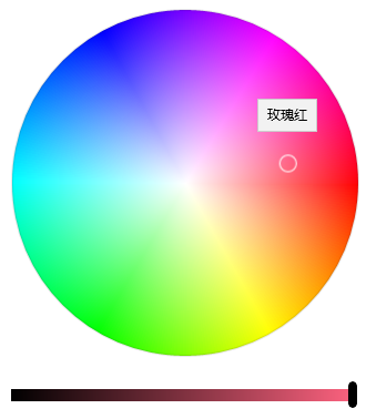
ColorSpectrumShape是定义ColorPicker外观的主要属性。当设置为ColorSpectrumShape.Box时显示正方形的光谱,设置为ColorSpectrumShape.Ring时显示为圆型的HSV色轮。
3.2 最简化显示
完整的ColorPicker实在太占空间,而且整个控件左边高右边低,很不平衡。使用以下设置可以隐藏ColorPreview及其它Text Box以最简化ColorPicker的显示,使它勉强正常一点。
<ColorPicker x:Name="ColorPicker"
             ColorSpectrumShape="Ring"
             IsColorPreviewVisible="False"
             IsColorChannelTextInputVisible="False"
             IsHexInputVisible="False" />
3.3 其它属性
使用如下XAML基本可以将所有元素显示出来:
<ColorPicker x:Name="ColorPicker"
         IsColorPreviewVisible="True"
         IsAlphaEnabled="True"
         IsMoreButtonVisible="True"/>
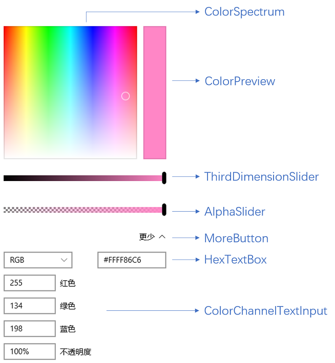
下面列表列出了各元素对应的属性。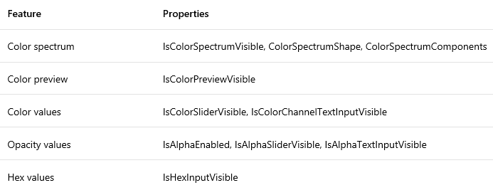
4. 封装ColorPicker
ColorPicker难用的地方在于它是个大块头,而且没有Header,摆在表单里面格格不入。官方文档里面还介绍了怎么把ColorPicker放在Button的Flyout里使用,都做到这样了还不如直接提供这个弹出控件。
为了使它更好用我把它简单地封装到一个弹出控件中。由于Picker控件通常都是指点击按钮弹出一个Popup或Flyout通过鼠标点击选择值的控件,例如DatePicker、TimePicker或者Extended WPF Toolkit 中的ColorPicker,UWP中的ColorPicker这个名称让我很为难,只好把自己封装的控件命名为ColorSelector。详细代码请见文章最后给出的Fluent Design System Sample源码。
<Style TargetType="local:ColorSelector">
<Setter Property="IsTabStop"
Value="False" />
<Setter Property="FontFamily"
Value="{ThemeResource ContentControlThemeFontFamily}" />
<Setter Property="FontSize"
Value="{ThemeResource ControlContentThemeFontSize}" />
<Setter Property="Template">
<Setter.Value>
<ControlTemplate TargetType="local:ColorSelector">
<StackPanel x:Name="LayoutRoot"
Margin="{TemplateBinding Padding}">
<VisualStateManager.VisualStateGroups>
<VisualStateGroup x:Name="CommonStates">
<VisualState x:Name="Normal" />
<VisualState x:Name="Disabled">
<Storyboard>
<ObjectAnimationUsingKeyFrames Storyboard.TargetName="HeaderContentPresenter"
Storyboard.TargetProperty="Foreground">
<DiscreteObjectKeyFrame KeyTime="0"
Value="{ThemeResource DatePickerHeaderForegroundDisabled}" />
</ObjectAnimationUsingKeyFrames>
</Storyboard>
</VisualState>
</VisualStateGroup>
<VisualStateGroup x:Name="PopupStates">
<VisualState x:Name="PopupOpened" />
<VisualState x:Name="PopupClosed" />
</VisualStateGroup>
</VisualStateManager.VisualStateGroups>
<local:HeaderedContentControl Header="{TemplateBinding Header}"
HeaderTemplate="{TemplateBinding HeaderTemplate}">
<ToggleButton x:Name="DateButton"
DataContext="{Binding RelativeSource={RelativeSource Mode=TemplatedParent},Path=Color}"
IsEnabled="{TemplateBinding IsEnabled}"
IsChecked="{Binding RelativeSource={RelativeSource Mode=TemplatedParent}, Path=IsDropDownOpen,Mode=TwoWay}"
HorizontalAlignment="Stretch"
HorizontalContentAlignment="Stretch">
<ToggleButton.Content>
<Grid>
<Grid.ColumnDefinitions>
<ColumnDefinition Width="Auto" />
<ColumnDefinition />
</Grid.ColumnDefinitions>
<TextBlock Text="Select A Color:" />
<Rectangle Grid.Column="1"
Margin="5,0,0,0">
<Rectangle.Fill>
<SolidColorBrush Color="{Binding}" />
</Rectangle.Fill>
</Rectangle>
</Grid>
</ToggleButton.Content>
<FlyoutBase.AttachedFlyout>
<Flyout Placement="Bottom"
x:Name="Flyout">
<Flyout.FlyoutPresenterStyle>
<Style TargetType="FlyoutPresenter">
<Setter Property="Padding"
Value="0" />
<Setter Property="BorderThickness"
Value="0" />
<Setter Property="Template">
<Setter.Value>
<ControlTemplate TargetType="FlyoutPresenter">
<ContentPresenter Background="{TemplateBinding Background}"
BorderBrush="{TemplateBinding BorderBrush}"
BorderThickness="{TemplateBinding BorderThickness}"
Content="{TemplateBinding Content}"
ContentTemplate="{TemplateBinding ContentTemplate}"
ContentTransitions="{TemplateBinding ContentTransitions}"
Margin="{TemplateBinding Padding}"
HorizontalAlignment="{TemplateBinding HorizontalContentAlignment}"
VerticalAlignment="{TemplateBinding VerticalContentAlignment}" />
</ControlTemplate>
</Setter.Value>
</Setter>
</Style>
</Flyout.FlyoutPresenterStyle>
<Grid>
<Grid.RowDefinitions>
<RowDefinition />
<RowDefinition Height="Auto" />
</Grid.RowDefinitions>
<ColorPicker x:Name="ColorPicker"
Style="{TemplateBinding ColorPickerStyle}"
IsColorPreviewVisible="False"
IsColorChannelTextInputVisible="False"
IsHexInputVisible="False" />
<Grid Grid.Row="1"
Height="45"
x:Name="AcceptDismissHostGrid">
<Grid.ColumnDefinitions>
<ColumnDefinition Width="*" />
<ColumnDefinition Width="*" />
</Grid.ColumnDefinitions>
<Rectangle Height="2"
VerticalAlignment="Top"
Fill="{ThemeResource DatePickerFlyoutPresenterSpacerFill}"
Grid.ColumnSpan="2" />
<Button x:Name="AcceptButton"
Grid.Column="0"
Content=""
FontFamily="{ThemeResource SymbolThemeFontFamily}"
FontSize="16"
HorizontalAlignment="Stretch"
VerticalAlignment="Stretch"
Style="{StaticResource DateTimePickerFlyoutButtonStyle}"
Margin="0,2,0,0" />
<Button x:Name="DismissButton"
Grid.Column="1"
Content=""
FontFamily="{ThemeResource SymbolThemeFontFamily}"
FontSize="16"
HorizontalAlignment="Stretch"
VerticalAlignment="Stretch"
Style="{StaticResource DateTimePickerFlyoutButtonStyle}"
Margin="0,2,0,0" />
</Grid>
</Grid>
</Flyout>
</FlyoutBase.AttachedFlyout>
</ToggleButton>
</local:HeaderedContentControl>
</StackPanel>
</ControlTemplate>
</Setter.Value>
</Setter>
</Style>
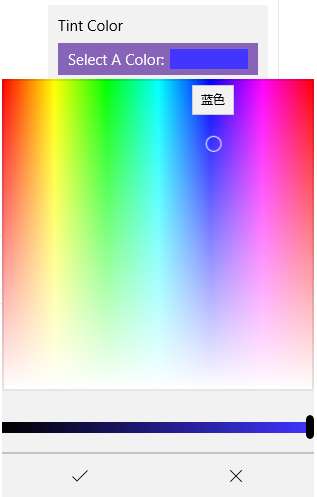
(也许是Flyout没有添加阴影或边框的原因,看起来丑丑的。)
5. 结语
Winform中有ColorDialog:
WPF有Extended WPF Toolkit 中的ColorPicker:
而UWP拖到现在才终于肯提供一个ColorPicker。每次更新技术都扔掉一些常用控件,导致开发者只能选择第三方控件或自己实现,连TreeView都是拖了几年才搞出来。这难道是微软对我们的考验吗?