0x0 前言
某设计网经常会有很多优秀漂亮的交互设计作品,有一天,偶遇这样的效果,动画流畅,交互自然,于是埋头自己解剖其中的元素,做了个开源控件,十来天有了一百来个star,觉得很受欢迎,今天专门写这潦草几笔,分享案发经过,希望对同行有所帮助。
0x1 准备
效果图
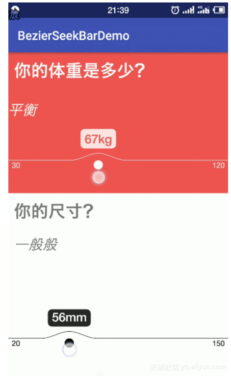
两个三阶贝塞尔曲线
1、默认状态:直线,首尾标注,默认值标注。
2、手指按下:曲线动画执行,标识小圆规则地放大,值的标注根据曲线波峰相对位置不变,向上同速移动,同时,标注背景渐变加深,动画结束。
3、手指拖动效果:曲线、小圆形、标注三者同时跟随触摸点移动,同时更新标注值。
4、手指离开屏幕:曲线收回动画执行,标识小圆规则缩小到默认状态,选中的值跟随波峰下沉到默认状态,标注背景渐变消失,动画结束。
圆形指示器部分
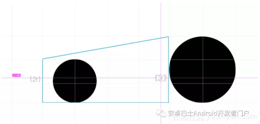
拆解状态三部分:默认状态、触摸过程中、触摸后状态。其中默认状态下指示器很小的圆形,距离水平曲线下方一个约定距离,当按下过程中,圆最下方坐标不变,圆直径逐渐增大,圆顶部与曲线的距离不变,直到动画结束。
功能分析
1、控件内元素:标尺、标注用的小圆、选中值,均可配置各自的颜色,
2、可配置值范围,
3、可配置默认值,
4、可实时监听选中的值。
5、可显示单位。
技术分析
曲线部分
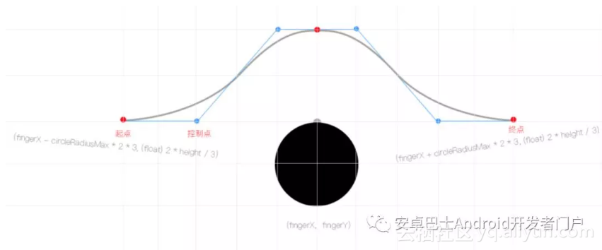
通过静态截图可知本控件主要元素为触摸触发的曲线和其伸缩效果。让我们来简单分析一下曲线部分的结构:
//这里展示曲线拆解图
拆解后,触摸部分为六阶贝塞尔曲线,五个基准点,四个控制点,我们将它拆分成两个三阶曲线即可。其中,首尾基准点的Y坐标固定,X坐标随着触摸位置相对移动,剩下的基准点X坐标相对固定,Y坐标根据动画规律升降。再说控制点,为保障默认状态下,曲线部分为水平,首尾两个控制点的Y坐标固定,X坐标相对固定,中间两个控制点Y坐标和中间那个基准点一致,X相对中间基准点固定。
(通过上面的拆解,可以让曲线在默认状态下是一条水平直线,并且在按下状态下,与水平位置、波峰位置,能有比较自然的过度弧形,不至于那么生硬。)
圆形指示器部分
普通圆形,相对自身底部向上变大、向下缩小还原。
动画部分
按下时的动画采用普通的ValueAnimator,匀速LinearInterpolator。另外还有个选中值的背景变化,根据动画进度改变画笔Alpha值即可。
//这里写点动画代码啰。
0x2 代码实现
泡杯茶,挽起袖子开撸!
继承View:
public class BezierSeekBar extends View {
public BezierSeekBar(Context context) {
super(context);
init(context, null);
}
public BezierSeekBar(Context context, @Nullable AttributeSet attrs) {
super(context, attrs);
init(context, attrs);
}
public BezierSeekBar(Context context, @Nullable AttributeSet attrs, int defStyleAttr) {
super(context, attrs, defStyleAttr);
init(context, attrs);
}
@RequiresApi(api = Build.VERSION_CODES.LOLLIPOP)
public BezierSeekBar(Context context, @Nullable AttributeSet attrs, int defStyleAttr, int defStyleRes) {
super(context, attrs, defStyleAttr, defStyleRes);
init(context, attrs);
}
private void init(Context context, AttributeSet attrs) {
this.context = context;
}
}
先绘制出曲线效果:
//第一个三阶曲线
bezierPath.moveTo(this.fingerX - circleRadiusMax * 2 * 3, (float) 2 * height / 3);
bezierPath.cubicTo(this.fingerX - circleRadiusMax * 2 * 2, (float) 2 * height / 3, this.fingerX - circleRadiusMax * 2 * 1, (float) 2 * height / 3 - bezierHeight, this.fingerX, (float) 2 * height / 3 - bezierHeight);
//第二个三阶曲线
bezierPath.moveTo(this.fingerX, (float) 2 * height / 3 - bezierHeight);
bezierPath.cubicTo(this.fingerX + circleRadiusMax * 2, (float) 2 * height / 3 - bezierHeight, this.fingerX + circleRadiusMax * 2 * 2, (float) 2 * height / 3, this.fingerX + circleRadiusMax * 2 * 3, (float) 2 * height / 3);
改变其Y坐标,让曲线恢复默认状态:
绘制完整线条:
//line1
bezierPath.reset();
bezierPath.moveTo(0, (float) 2 * height / 3);
bezierPath.lineTo(this.fingerX - circleRadiusMax * 2 * 3, (float) 2 * height / 3);
//bezier1
bezierPath.moveTo(this.fingerX - circleRadiusMax * 2 * 3, (float) 2 * height / 3);
bezierPath.cubicTo(this.fingerX - circleRadiusMax * 2 * 2, (float) 2 * height / 3, this.fingerX - circleRadiusMax * 2 * 1, (float) 2 * height / 3 - bezierHeight, this.fingerX, (float) 2 * height / 3 - bezierHeight);
//bezier2
bezierPath.moveTo(this.fingerX, (float) 2 * height / 3 - bezierHeight);
bezierPath.cubicTo(this.fingerX + circleRadiusMax * 2, (float) 2 * height / 3 - bezierHeight, this.fingerX + circleRadiusMax * 2 * 2, (float) 2 * height / 3, this.fingerX + circleRadiusMax * 2 * 3, (float) 2 * height / 3);
//line2
bezierPath.lineTo(width, (float) 2 * height / 3);
canvas.drawPath(bezierPath, bezierPaint);
添加Touch事件拦截,按下时显示曲线:
@Override
public boolean onTouchEvent(MotionEvent event) {
switch (event.getAction()) {
case MotionEvent.ACTION_DOWN:
fingerX = event.getX();
if (fingerX < 0F) fingerX = 0F;
if (fingerX > width) fingerX = width;
//触摸介质进入控件,开始动画过渡
this.animatorFingerIn.start();
break;
case MotionEvent.ACTION_MOVE:
fingerX = event.getX();
if (fingerX < 0F) fingerX = 0F;
if (fingerX > width) fingerX = width;
postInvalidate();
break;
case MotionEvent.ACTION_UP:
//触摸介质离开控件,执行动画
this.animatorFingerOut.start();
break;
}
valueSelected = Integer.valueOf(decimalFormat.format(valueMin + (valueMax - valueMin) * fingerX / width));
if (selectedListener != null) {
selectedListener.onSelected(valueSelected);
}
return true;
}
添加动画效果:
this.animatorFingerIn = ValueAnimator.ofFloat(0f, 1f);
this.animatorFingerIn.setDuration(200L);
this.animatorFingerIn.setInterpolator(new LinearInterpolator());
this.animatorFingerOut = ValueAnimator.ofFloat(1f, 0f);
this.animatorFingerOut.setDuration(200L);
this.animatorFingerOut.setInterpolator(new LinearInterpolator());
this.animatorFingerOut.addUpdateListener(new ValueAnimator.AnimatorUpdateListener() {
@Override
public void onAnimationUpdate(ValueAnimator animation) {
float progress = (float) animation.getAnimatedValue();
animInFinshed = (progress >= 0.15F);
txtSelectedBgPaint.setAlpha((int) (255 * (progress - 0.15F)));
if (progress >= 0.95F) {
textPaint.setColor(colorValueSelected);
} else {
textPaint.setColor(colorValue);
}
bezierHeight = circleRadiusMax * 1.5F * progress;
circleRadius = circleRadiusMin + (circleRadiusMax - circleRadiusMin) * progress;
spaceToLine = circleRadiusMin * 2 * (1F - progress);
postInvalidate();
}
});
绘制圆形指示器,根据动画进度改变其大小:
canvas.drawCircle(this.fingerX, (float) 2 * height / 3 + spaceToLine + circleRadius, circleRadius, ballPaint);
添加其它辅助元素后,配置通用属性,抛出公共方法:
<declare-styleable name="BezierSeekBar">
//曲线颜色
<attr name="bsBar_color_line" format="reference|color" />
//圆形指示器颜色
<attr name="bsBar_color_ball" format="reference|color" />
//阀值的文本颜色
<attr name="bsBar_color_value" format="reference|color" />
//选中值的文本颜色
<attr name="bsBar_color_value_selected" format="reference|color" />
//选中值的文本颜色背景
<attr name="bsBar_color_bg_selected" format="reference|color" />
//阀值最小
<attr name="bsBar_value_min" format="integer" />
//阀值最大
<attr name="bsBar_value_max" format="integer" />
//默认选中值
<attr name="bsBar_value_selected" format="integer" />
//单位
<attr name="bsBar_unit" format="reference|string" />
</declare-styleable>
private void initAttr(Context context, AttributeSet attrs) {
if (attrs != null) {
TypedArray attributes = context.obtainStyledAttributes(attrs, R.styleable.BezierSeekBar);
this.colorBall = attributes.getColor(R.styleable.BezierSeekBar_bsBar_color_ball, Color.BLACK);
this.colorLine = attributes.getColor(R.styleable.BezierSeekBar_bsBar_color_line, Color.BLACK);
this.colorValue = attributes.getColor(R.styleable.BezierSeekBar_bsBar_color_value, Color.BLACK);
this.colorValueSelected = attributes.getColor(R.styleable.BezierSeekBar_bsBar_color_value_selected, Color.WHITE);
this.colorBgSelected = attributes.getColor(R.styleable.BezierSeekBar_bsBar_color_bg_selected, Color.BLACK);
this.valueMin = attributes.getInteger(R.styleable.BezierSeekBar_bsBar_value_min, 30);
this.valueMax = attributes.getInteger(R.styleable.BezierSeekBar_bsBar_value_max, 150);
this.valueSelected = attributes.getInteger(R.styleable.BezierSeekBar_bsBar_value_selected, 65);
this.unit = attributes.getString(R.styleable.BezierSeekBar_bsBar_unit) + "";
attributes.recycle();
}
}
最后,测试一下:
<tech.nicesky.bezierseekbar.BezierSeekBar
android:id="@+id/bsBar_test"
app:bsBar_color_ball="@android:color/white"
app:bsBar_color_bg_selected="@android:color/white"
app:bsBar_color_line="@android:color/white"
app:bsBar_color_value="@android:color/white"
app:bsBar_color_value_selected="#ef5350"
app:bsBar_value_min="30"
app:bsBar_value_max="120"
app:bsBar_value_selected="65"
app:bsBar_unit="kg"
android:layout_width="match_parent"
android:layout_height="wrap_content"
/>
完美 :) !