使用pheatmap包绘制热图
- 一般而言,pheatmap较heatmap.2等更为简洁以及易于理解,对于初学者而言是一款不错的热图绘制软件。
rm(list=ls())

setwd("E:\\Rwork")
library(pheatmap)
#创建数据集test测试矩阵
test = matrix(rnorm(400), 20, 20)
colnames(test) <- paste("sample",1:20,sep = "")
rownames(test)   <- paste("gene", 1:20,sep = "")
test[1:10, seq(1, 20, 2)] = test[1:10, seq(1, 20, 2)] + 5
test[11:20, seq(2, 20, 2)] = test[11:20, seq(2, 20, 2)] - 5
pheatmap(test)
- cluster_row = FALSE, cluster_col = FALSE
- treeheight_row=0, treeheight_col=0
# 在热图格子里展示文本
pheatmap(test, display_numbers = TRUE)
pheatmap(test, display_numbers = TRUE,
         number_format = "%.1e")
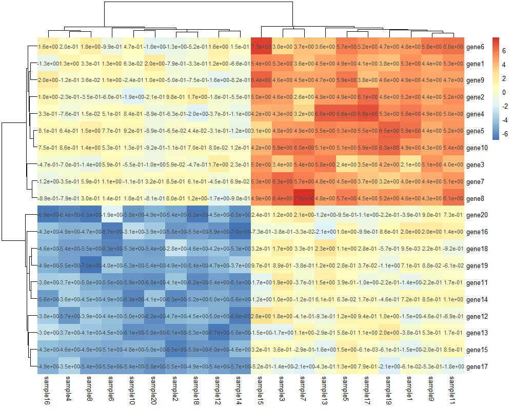
cluster_row = FALSE, cluster_col = FALSE是否聚类,#可设置参数display_numbers将数值显示在热图的格子中,可通过number_format设置数值的格式,较常用的有".2f"(保留小数点后两位),".1e"(科学计数法显示,保留小数点后一位),number_color设置显示内容的颜色:
pheatmap(test, display_numbers = TRUE, number_format = "%.2f", number_color="purple") #"%.2f"表示保留小数点后两位
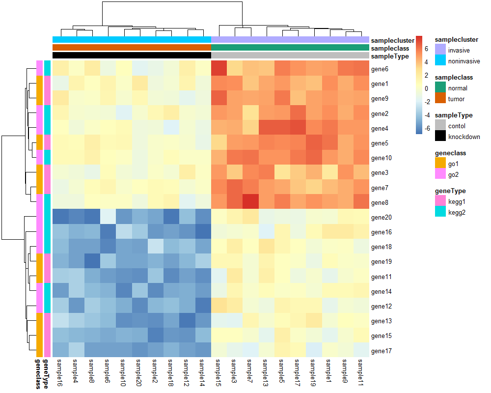
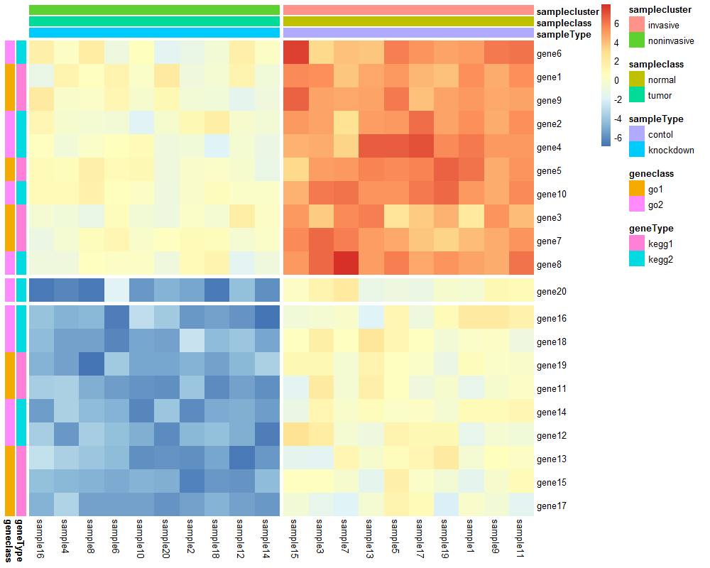
#pheatmap还可以显示行或列的分组信息,支持多种分组;
annotation_col = data.frame(sampleType = factor(rep(c("contol", "knockdown"),10)),
                            sampleclass = factor(rep(c("normal", "tumor"),10)),
                            samplecluster = factor(rep(c("invasive", "noninvasive"),10)))
rownames(annotation_col) <- colnames(test)


annotation_row = data.frame(geneType = factor(rep(c("kegg1", "kegg2"),10)),
                           geneclass = factor(rep(c("go1", "go2"),10))
                          )
rownames(annotation_row) <- rownames(test)

pheatmap(test, annotation_col = annotation_col,
         annotation_row = annotation_row,
         treeheight_row=0, treeheight_col=0,
         cutree_rows=3,cutree_cols=2)
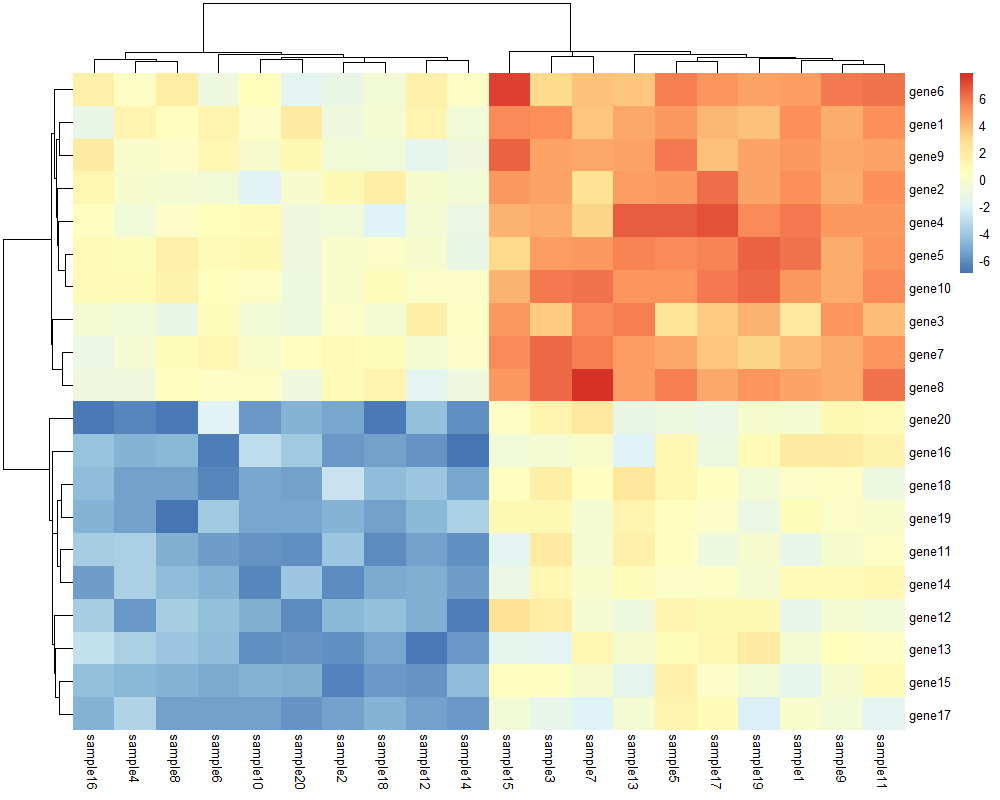
#pheatmap还能够根据特定的条件将热图分隔开;
# cutree_rows, cutree_cols:根据行列的聚类数将热图分隔开;
pheatmap(test,cutree_rows=2,cutree_cols=2)

#还可以自己设定各个分组的颜色
ann_colors = list(sampleType = c(contol = "grey", knockdown = "black"), #连续数值型分组可设置成渐变
                  sampleclass = c(normal = "#1B9E77", tumor= "#D95F02"))
pheatmap(test, annotation_col = annotation_col, annotation_row = annotation_row,
         annotation_colors = ann_colors)