本文主要介绍 在 bokeh 中 对 ColumnDataSource 类型数据中进行:
(1)添加新的数据 (2)修改更新已有数据 (3)筛选数据。
Table of Contents
-
1 添加新的数据
-
2 数据更新
-
2.1 更新单个数据
-
2.2 更新多个数据
-
-
3 筛选数据
-
3.1 Indexfilter
-
3.2 BooleanFilter
-
3.3 GroupFilter
-
本文的环境为
-
window 7 系统
-
python 3.6
-
Jupyter Notebook
-
bokeh 0.13.0
数据是进行数据可视化的必要基础, 前文介绍了 bokeh 中数据呈现的几种方式。
本文主要介绍 在 bokeh 中 对 ColumnDataSource 类型数据中进行:
(1)添加新的数据 (2)修改更新已有数据 (3)筛选数据。
首先加载相关Python库。
-
from bokeh.plotting import figure, output_notebook, show -
from bokeh.layouts import gridplot -
from bokeh.models import ColumnDataSource -
import numpy as np -
import pandas as pd -
-
output_notebook()
1 添加新的数据
ColumnDataSource 通过 stream() 方法来添加新的数据
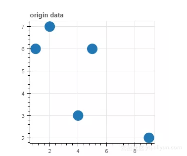
-
data1 = {'x_values': [1, 2, 9, 4, 5], -
'y_values': [6, 7, 2, 3, 6]} -
-
source = ColumnDataSource(data=data1) -
-
p1 = figure(plot_width=300, plot_height=300, title= 'origin data') -
p1.circle(x='x_values', y='y_values', source=source, size=20) -
-
show(p1)
图示如下:
-
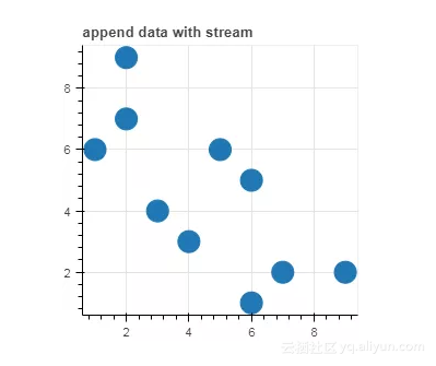
new_data = {'x_values': [6, 7, 2, 3, 6], -
'y_values': [1, 2, 9, 4, 5]} -
-
# 在已有数据基础上添加新的数据 (append) -
source.stream(new_data) -
-
p2 = figure(plot_width=300, plot_height=300,title= 'append data with stream') -
p2.circle(x='x_values', y='y_values', source=source, size=20) -
-
show(p2)
图示如下:
2 数据更新
用 patch 方法可以更新 ColumnDataSource 的数据。
-
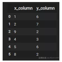
data = {'x_column': [1, 2, 9, 4, 5, 8], -
'y_column': [6, 7, 2, 3, 6, 2]} -
-
df = pd.DataFrame(data=data) -
-
df
如下:
-
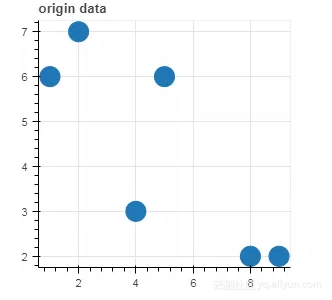
source = ColumnDataSource(data=df) -
-
p1 = figure(plot_width=300, plot_height=300, title= 'origin data') -
p1.circle(x='x_column', y='y_column', source=source, size=20) -
-
show(p1)
图示如下:
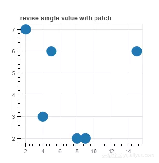
2.1 更新单个数据
-
# 更新单个数据 -
# {column:(index, new_value) } -
source.patch({'x_column':[(0,15)]}) -
-
p2 = figure(plot_width=300, plot_height=300,title= 'revise single value with patch') -
p2.circle(x='x_column', y='y_column', source=source, size=20) -
-
show(p2)
图示如下:
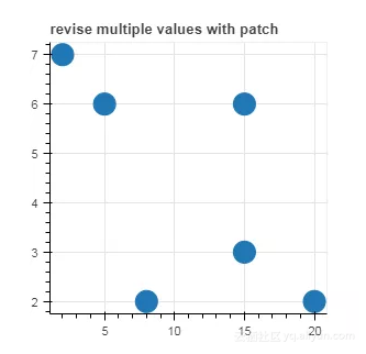
2.2 更新多个数据
-
# 更新多个数据 -
# {column:(slice, new_values) } -
-
s = slice(2,4) -
source.patch({'x_column':[(s,[20,15])]}) -
-
p2 = figure(plot_width=300, plot_height=300,title= 'revise multiple values with patch') -
p2.circle(x='x_column', y='y_column', source=source, size=20) -
-
show(p2)
图示如下:
3 筛选数据
在Bokeh 中, ColumnDataSource (CDS) 提供了 CDSView 来对数据进行筛选
其一般用法如下:
from bokeh.models import ColumnDataSource, CDSView
source = ColumnDataSource(some_data)
view = CDSView(source=source, filters=[filter1, filter2])
其中 filters 包括 IndexFilter, BooleanFilter, GroupFilter 等
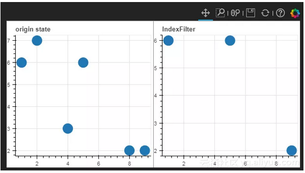
3.1 Indexfilter
根据数据的索引来筛选数据
-
from bokeh.plotting import figure -
from bokeh.models import ColumnDataSource, CDSView, IndexFilter -
from bokeh.layouts import gridplot -
-
data = {'x_column': [1, 2, 9, 4, 5, 8], -
'y_column': [6, 7, 2, 3, 6, 2]} -
-
df = pd.DataFrame(data=data) -
source = ColumnDataSource(data=df) -
view = CDSView(source=source, filters=[IndexFilter([0,2,4])]) -
-
p1 = figure(plot_width=300, plot_height=300, title='origin state') -
p1.circle(x='x_column', y='y_column', source=source, size=20) -
-
p2 = figure(plot_width=300, plot_height=300, title='IndexFilter') -
p2.circle(x='x_column', y='y_column', source=source, size=20, view=view) -
-
grid=gridplot([p1,p2],ncols=2, plot_width=300,plot_height=300) -
-
show(grid)
图示如下:
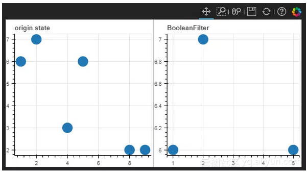
3.2 BooleanFilter
根据布尔值, True 或 False 来筛选数据
-
from bokeh.models import BooleanFilter -
from bokeh.layouts import row -
-
booleans = [True if y_val>4 else False for y_val in source.data['y_column']] -
view_booleans = CDSView(source=source, filters=[BooleanFilter(booleans)]) -
-
p1 = figure(plot_width=300, plot_height=300,title='origin state') -
p1.circle(x='x_column', y='y_column', source=source, size=20) -
-
p2 = figure(plot_width=300, plot_height=300, title='BooleanFilter') -
p2.circle(x='x_column', y='y_column', source=source, size=20, view=view_booleans) -
-
grid=gridplot([p1,p2],ncols=2,plot_width=300,plot_height=300) -
-
show(grid)
图示如下:
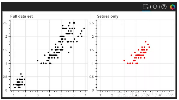
3.3 GroupFilter
使用 GroupFilter 可以筛选出包含特定类型的所有行数据。 GroupFilter 有两个参数, 即 Column_name 和 group, 也就是 列名 和 类别名称。
如下面的官方例子所述,如果想筛选 iris 数据中 特定类别的花,可以使用 GroupFilter 方法。
-
from bokeh.plotting import figure, show -
from bokeh.layouts import gridplot -
from bokeh.models import ColumnDataSource, CDSView, GroupFilter -
-
from bokeh.sampledata.iris import flowers -
-
# output_file("group_filter.html") -
-
source = ColumnDataSource(flowers) -
view1 = CDSView(source=source, filters=[GroupFilter(column_name='species', group='versicolor')]) -
-
plot_size_and_tools = {'plot_height': 300, 'plot_width': 300, -
'tools':['box_select', 'reset', 'help']} -
-
p1 = figure(title="Full data set", **plot_size_and_tools) -
p1.circle(x='petal_length', y='petal_width', source=source, color='black') -
-
p2 = figure(title="Setosa only", x_range=p1.x_range, y_range=p1.y_range, **plot_size_and_tools) -
p2.circle(x='petal_length', y='petal_width', source=source, view=view1, color='red') -
-
show(gridplot([[p1, p2]]))
图示如下:
当然,还有一些其他的筛选方法,有兴趣的同学可以自己挖掘下~~
原文发布时间为:2018-10-11
本文作者:
本文来自云栖社区合作伙伴“ ”,了解相关信息可以关注“ ”。