在 WPF 上可用的控件拖动方法在 UWP 上大多没用,那干脆用 Thumb 仿制一个吧。
关于 Thumb 控件的教程也不多,毕竟在 WPF 控件拖动有很多种方法, Thumb 就显得很鸡肋了。下面我就简单的说说。(MSDN 文档)
不谈什么属性和方法,大多数都是继承的。主要说说 Thumb 的原生事件 DragStarted,DragDelta,DragCompleted。
DragStarted 和字面意思差不多,开始拖动的时候发生的。
DragDelta 拖动进行中,只要你鼠标不放就会一直进行。
DragCompleted 拖动结束后发生。
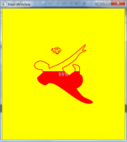
下面就来仿制一个可以拖动的圆形 Button,像 IPhone 的“小圆点”一样(像下图一样),只不过功能单一,仅仅用来打开 MainPage 里的汉堡菜单。本文仿制 Button 的时候只需要 DragDelta 事件。
实现很简单,我就不写示例了。
我有一个 SplitView “RootSplitView”,作为汉堡菜单的容器。
首先需要在合适的页面敲上一个 <Thumb />,给它个 Name="RootThumb",我是把它放在页面右下角的。
<Thumb Name="RootThumb" Height="55" Width="55" HorizontalAlignment="Right" VerticalAlignment="Bottom" Canvas.ZIndex="101" />
这时设计器右下角应该出现了一个方块,但它不是我需要的圆形,下面打开 Blend 进行样式定制(前面讲 横向ListView 时提过)。默认的 Thumb 样式如下。
<Style x:Key="ThumbStyle1" TargetType="Thumb">
            <Setter Property="Background" Value="{ThemeResource ThumbBackground}"/>
            <Setter Property="BorderThickness" Value="1"/>
            <Setter Property="IsTabStop" Value="False"/>
            <Setter Property="BorderBrush" Value="{ThemeResource ThumbBorderBrush}"/>
            <Setter Property="Template">
                <Setter.Value>
                    <ControlTemplate TargetType="Thumb">
                        <Grid>
                            <VisualStateManager.VisualStateGroups>
                                <VisualStateGroup x:Name="CommonStates">
                                    <VisualState x:Name="Normal"/>
                                    <VisualState x:Name="PointerOver">
                                        <Storyboard>
                                            <DoubleAnimation Duration="0" To="1" Storyboard.TargetProperty="Opacity" Storyboard.TargetName="BackgroundPointerOver"/>
                                            <DoubleAnimation Duration="0" To="0" Storyboard.TargetProperty="Opacity" Storyboard.TargetName="Background"/>
                                        </Storyboard>
                                    </VisualState>
                                    <VisualState x:Name="Pressed">
                                        <Storyboard>
                                            <DoubleAnimation Duration="0" To="1" Storyboard.TargetProperty="Opacity" Storyboard.TargetName="BackgroundPressed"/>
                                            <DoubleAnimation Duration="0" To="0" Storyboard.TargetProperty="Opacity" Storyboard.TargetName="Background"/>
                                        </Storyboard>
                                    </VisualState>
                                    <VisualState x:Name="Disabled"/>
                                </VisualStateGroup>
                            </VisualStateManager.VisualStateGroups>
                            <Border x:Name="Background" BorderBrush="{TemplateBinding BorderBrush}" BorderThickness="{TemplateBinding BorderThickness}" Background="{TemplateBinding Background}"/>
                            <Border x:Name="BackgroundPointerOver" BorderBrush="{ThemeResource ThumbBorderBrushPointerOver}" BorderThickness="{TemplateBinding BorderThickness}" Background="{ThemeResource ThumbBackgroundPointerOver}" Opacity="0"/>
                            <Border x:Name="BackgroundPressed" BorderBrush="{ThemeResource ThumbBorderBrushPressed}" BorderThickness="{TemplateBinding BorderThickness}" Background="{ThemeResource ThumbBackgroundPressed}" Opacity="0"/>
                        </Grid>
                    </ControlTemplate>
                </Setter.Value>
            </Setter>
        </Style>
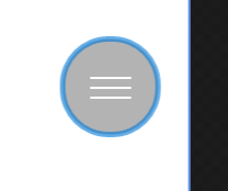
因为需要一个圆形并且里面有个汉堡菜单的图标的仿制 Button,我们需要在默认样式提过的 RootGrid 里画个圆,顺便来个 TextBlock 用来显示汉堡菜单的图标。定制好的样式如下。
<Style x:Key="ThumbStyle1" TargetType="Thumb"> <Setter Property="Background" Value="Transparent"/> <Setter Property="BorderThickness" Value="1"/> <Setter Property="IsTabStop" Value="False"/> <Setter Property="BorderBrush" Value="{ThemeResource ThumbBorderBrush}"/> <Setter Property="Template"> <Setter.Value> <ControlTemplate TargetType="Thumb"> <Grid x:Name="RootGrid"> <VisualStateManager.VisualStateGroups> <VisualStateGroup x:Name="CommonStates"> <VisualState x:Name="Normal"/> <VisualState x:Name="PointerOver"> <Storyboard> <DoubleAnimation Duration="0" To="1" Storyboard.TargetProperty="Opacity" Storyboard.TargetName="BackgroundPointerOver"/> <DoubleAnimation Duration="0" To="0" Storyboard.TargetProperty="Opacity" Storyboard.TargetName="Background"/> </Storyboard> </VisualState> <VisualState x:Name="Pressed"> <Storyboard> <DoubleAnimation Duration="0" To="1" Storyboard.TargetProperty="Opacity" Storyboard.TargetName="BackgroundPressed"/> <DoubleAnimation Duration="0" To="0" Storyboard.TargetProperty="Opacity" Storyboard.TargetName="Background"/> </Storyboard> </VisualState> <VisualState x:Name="Disabled"/> </VisualStateGroup> </VisualStateManager.VisualStateGroups> <Rectangle RadiusY="25" RadiusX="25" Fill="Gray" Opacity="0.6" Stroke="{ThemeResource SystemControlBackgroundAccentBrush}" StrokeThickness="3" /> <TextBlock FontFamily="Segoe MDL2 Assets" Text="" FontSize="22" Foreground="White" HorizontalAlignment="Center" VerticalAlignment="Center" /> <Border x:Name="Background" BorderBrush="{TemplateBinding BorderBrush}" BorderThickness="{TemplateBinding BorderThickness}" Background="{TemplateBinding Background}"/> <Border x:Name="BackgroundPointerOver" BorderBrush="{ThemeResource ThumbBorderBrushPointerOver}" BorderThickness="{TemplateBinding BorderThickness}" Background="Transparent" Opacity="0"/> <Border x:Name="BackgroundPressed" BorderBrush="{ThemeResource ThumbBorderBrushPressed}" BorderThickness="{TemplateBinding BorderThickness}" Background="Transparent" Opacity="0"/> </Grid> </ControlTemplate> </Setter.Value> </Setter> </Style>
这时,设计器里应该出现了这个玩意儿(得意~~~)
Button 的 Click 事件怎么实现呢?有 PointerPressed 和 Tapped 两个备选事件。现在的交互事件有三种:Mouse Events(鼠标事件),Touch Events(触摸事件)和 Pointer Events(指针事件),分别为不同的设备提供不同的交互方式。说这么多废话其实直接试试就好了。。。在 Thumb 的 xml 标记里添加 Tapped="RootThumb_Tapped",事件代码如下
private void MainThumb_Tapped(object sender, TappedRoutedEventArgs e)
{
  RootSplitView.IsPaneOpen = !RootSplitView.IsPaneOpen;
}
下面说说拖动怎么实现,需要编写 DragDelta 事件。由于 Win10 设备体系庞大,UWP 上谈控件坐标没啥意义,这也正是 WPF 上的控件拖动方案没用的原因。如果你在设计器里像 WinForm 一样拖拽控件设计布局的话,xaml 会给被拖拽的控件一个 Margin,因此 Thumb 的拖拽实现也用的 Margin。首先你需要定义两个 double 私有字段记录 X, Y 轴的位移量。设计目的是 Thumb 在右下角,而页面的坐标零点在左上角,只需要将 Thumb 的 Margin 的 Right,Bottom 给一个位移量的负值即可。完整代码如下。
private void MainThumb_DragDelta(object sender, DragDeltaEventArgs e)
{
  // 两个 double 类型,用来记录偏移量
  thumbX += e.HorizontalChange;
  thumbY += e.VerticalChange;

  MainThumb.Margin = new Thickness(0, 0, -thumbX, -thumbY);
}
这样,一个圆形的可拖动 Button 就用 Thumb 仿制完成了。