CSS定位有四种模式:static、relative、absolute、fixed,其它static是默认值,下面分别讲解下各自的特点;
static:静态定位,处于动态布局流中,按照页面中的各元素先后顺序、父子关系自动排列与布局,每个静态定位元素均占用动态布局的一块空间;
relative:相对定位,处于动态布局流中,如果设置了偏移量(LEFT或TOP的值),则会有相应的位置调整,位置调整的标准是基于上一个处于动态布局流中的元素(即:设为static及relative元素);
absolute:绝对定位,不在动态布局流中,动态布局流中会忽略该元素的存在(即不计算该类元素的占用空间,且默认处于未设置Z-INDEX的 普通元素的上层),如果设置了偏移量(LEFT或TOP的值),则会有相应的位置调整,位置调整的标准是基于非静态定位的父元素(或者说是 非静态定位包裹的元素),如果没有符合条件的父元素,则以BODY为标准;如果没有设置偏移量,则直接将元素当前的位置做位默认的偏移 量,另外,绝对定位具有包裹性,即块级元素被绝对定位后,除非显示式设置元素的宽度与高度,否则元素的默认宽度与高度是以元素的内 容来自动适应的;
fixed:固定定位,不在动态布局流中,动态布局流中会忽略该元素的存在(即不计算该类元素的占用空间,且默认处于未设置Z-INDEX的普 通元素的上层),如果设置了偏移量(LEFT或TOP的值),则会有相应的位置调整,位置调整的标准是基于浏览器窗口的(可以理解为BODY) ,如果没有设置偏移量,则直接将元素当前的位置做位默认的偏移量,另外,固定定位具有包裹性,即块级元素被固定定位后,除非显示式设置元素的宽度与高度,否则元素的默认宽度与高度是以元素的内容来自动适应的;还有若设置或默认的的位偏移量大于浏览器窗口范围则不会显示;
以下是上面四种定位方法的演示代码:
|
1
2
3
4
5
6
7
8
9
10
11
12
13
14
15
16
17
18
19
20
21
22
23
24
25
26
27
28
29
30
31
32
33
34
35
36
37
38
39
40
41
42
43
44
45
46
47
48
49
50
51
52
53
54
55
56
57
58
59
60
61
62
63
64
|
<!
DOCTYPE
html>
<
html
>
<
head
>
<
meta
charset="utf-8"/>
<
title
>CSS Study</
title
>
<
style
type="text/css">
html, body {
margin:0px;
padding:0px;
height:100%;
}
#div0{
position:static;
background-color:gray;
height:200px;
}
#div1 {
position:relative;
background-color:green;
height:200px;
}
#div2 {
position: absolute;
height: 50px;
background-color: red;
top: 20px;
left: 50px;
z-index: 9999;
}
#div3{
position:fixed;
background-color:yellow;
}
</
style
>
<
script
type="text/javascript">
window.onload = function () {
alertpostion("div2");
alertpostion("div3");
}
function alertpostion(divid)
{
var odiv = document.getElementById(divid);
var top = odiv.offsetTop;
var left = odiv.offsetLeft;
alert("top:" + top +",left:" + left);
}
</
script
>
</
head
>
<
body
>
<
div
id="div0">
div0 content position:static;
</
div
>
<
div
id="div1">
div1 content position:relative;
<
div
id="div2">
div2 content position: absolute;
</
div
>
</
div
>
<
div
id="div3">
div3 content position:fixed;
</
div
>
</
body
>
</
html
>
|
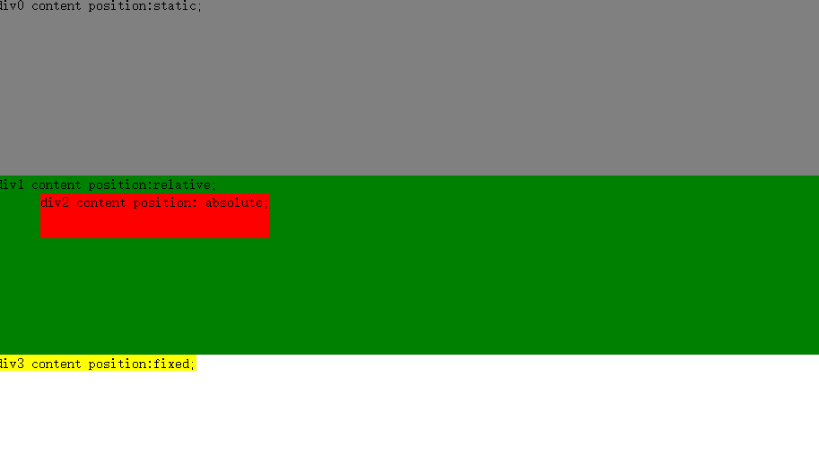
最终显示的效果如下图示:
理解了CSS各种定位的原理及其作用,我们可以通过CSS定位来实现常见的页面布局
第一种:左右布局,左边固定大小,右边宽度自适应,代码如下:
|
1
2
3
4
5
6
7
8
9
10
11
12
13
14
15
16
17
18
19
20
21
22
23
24
25
26
27
28
29
30
31
32
33
34
35
36
37
38
39
40
41
42
43
44
45
46
47
48
49
|
<!
DOCTYPE
html>
<
html
>
<
head
>
<
meta
charset="utf-8" />
<
title
>CSS Study</
title
>
<
style
type="text/css">
html, body {
margin: 0px;
padding: 0px;
height: 100%;
}
#warper{
margin:0px;
padding:0px;
height:100%;
background-color:skyblue;
}
#sidebar{
position:absolute;
top:0px;
width:200px;
height:100%;
background-color:green;
}
#content{
position:relative;
left:200px;
height:100%;
background-color:orange;
}
</
style
>
</
head
>
<
body
>
<
div
id="warper">
<
div
id="content">
content contentcontentcontentcontentcontentcontentcontentcontentcontentcontentcontentcontentcontentcontentcontentcontentcontentcontentcontentcontentcontentcontentcontentcontentcontent
contentcontentcontentcontentcontentcontentcontentcontentcontentcontentcontentcontentcontent
</
div
>
<
div
id="sidebar">
sidebar
</
div
>
</
div
>
</
body
>
</
html
>
|
实现效果如下图示:
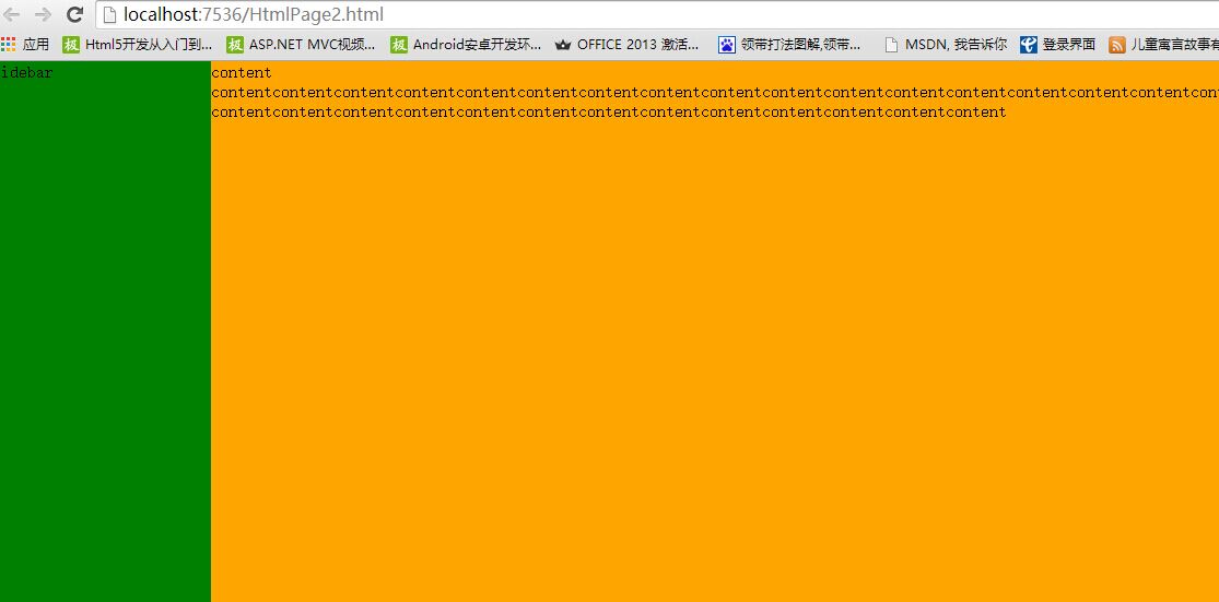
大家看了代码后,可能有疑惑,为何要将content放在左边,而不是右边,原因在于:content需要保持自适应的宽度,即:100%,那么它就必需占据整行空间,只有采用相对定位,然后将左边的偏移量设为需要空出的位置,即:200PX;这样就实现了非左边的200PX位,其余的都是content的区域;sidebar这里就必需设置为绝对定位,因为它在不采用浮动的情况下是无法进行位置设置的,将它的左边偏移量设为0PX,宽度设为200PX;这样就会定位到左边content空出的区域,从而实现整个页面的左右布局。
第二种:左右布局,左边宽度自适应,右边固定,代码如下:
|
1
2
3
4
5
6
7
8
9
10
11
12
13
14
15
16
17
18
19
20
21
22
23
24
25
26
27
28
29
30
31
32
33
34
35
36
37
38
39
40
41
42
43
44
45
46
47
48
49
50
51
52
53
54
55
56
57
|
<!
DOCTYPE
html>
<
html
>
<
head
>
<
meta
charset="utf-8" />
<
title
>CSS Study</
title
>
<
style
type="text/css">
html, body {
margin: 0px;
padding: 0px;
height: 100%;
}
#warper{
margin:0px;
padding:0px;
height:100%;
background-color:skyblue;
}
#content {
float:left;
height: 100%;
width:100%;
margin-right:-200px;
background-color: orange;
}
#content-inner{
height:100%;
margin-right:200px;
background-color:red;
overflow:auto;
}
#sidebar {
float: left;
top: 0px;
width: 200px;
height: 100%;
background-color: green;
}
</
style
>
</
head
>
<
body
>
<
div
id="warper">
<
div
id="content">
<
div
id="content-inner">
content
</
div
>
</
div
>
<
div
id="sidebar">
sidebar
</
div
>
</
div
>
</
body
>
</
html
>
|
实现效果如下图示:

实现原理说明:先将content元素向左浮动,由于浮动也具有包裹性,所以必需显示设置宽度为100%,但右边需要放置侧边栏,所以将外边距设为-200PX,使得允许后续元素(即:sidebar)可以进入content元素的右边200PX的空间,再将sidebar元素也设为向左浮动,宽度设为200PX,这样它就能定位在content元素的右边,由于content元素的右边被sidebar元素占用了200PX,所以在content元素再加上一个content-inner元素,并将其右外边距设为200PX,形成右边200PX被空出,这样就能避免被sidebar元素遮盖,从而形成网页整体的左右布局。
第三种:左中右布局,左右为固定宽度,中间宽度自适应,代码如下:
|
1
2
3
4
5
6
7
8
9
10
11
12
13
14
15
16
17
18
19
20
21
22
23
24
25
26
27
28
29
30
31
32
33
34
35
36
37
38
39
40
41
42
43
44
45
46
47
48
49
50
51
52
53
54
55
|
<!
DOCTYPE
html>
<
html
>
<
head
>
<
meta
charset="utf-8"/>
<
title
></
title
>
<
style
type="text/css">
html,body{
height:100%;
margin:0px;
padding:0px;
}
#warper {
position:relative;
height:100%;
}
#left {
position: absolute;
top: 0px;
left: 0px;
height: 100%;
width: 200px;
background-color: red;
}
#right {
position: absolute;
top:0px;
right: 0px;
width: 200px;
height: 100%;
background-color: green;
}
#content{
margin:0px 200px 0px 200px;
height:100%;
background-color:orange;
}
</
style
>
</
head
>
<
body
>
<
div
id="warper">
<
div
id="left">
left
</
div
>
<
div
id="content">
content
</
div
>
<
div
id="right">
right
</
div
>
</
div
>
</
body
>
</
html
>
|
实现效果如下图示:
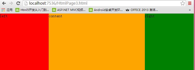
实现原理说明:首先将warper元素设为相对定位,以确保被包裹的三个DIV元素在进行定位时是统一基于warper元素,然后将left元素与right元素分别设为固定定位及宽度均为200PX(宽度可依实际情况设置),并将left元素的位偏移设为LEFT=0,TOP=0(当然也可以不用显示设置,因为默认就是这样的),将right元素的位偏移量设为RIGHT=0使其靠右边固定,TOP=0使其与warper元素顶部平行,最后只需将content元素的左右两边外边距设为:200PX;使其左右两边各让出200PX空间,最终形成左中右布局;
第四种布局:上中下布局,上面与下面固定高度及固定位置,中间自适应高度,代码如下:
|
1
2
3
4
5
6
7
8
9
10
11
12
13
14
15
16
17
18
19
20
21
22
23
24
25
26
27
28
29
30
31
32
33
34
35
36
37
38
39
40
41
42
43
44
45
46
47
48
49
50
51
52
53
54
55
56
57
58
59
60
61
62
63
64
|
<!
DOCTYPE
html>
<
html
>
<
head
>
<
meta
charset="utf-8" />
<
title
></
title
>
<
style
type="text/css">
html, body {
margin: 0px;
padding: 0px;
height: 100%;
}
#warper {
position:relative;
margin: 0px;
padding: 0px;
height: 100%;
}
#header{
position:fixed;
top:0px;
height:50px;
width:100%;
background-color:yellowgreen;
}
#footer {
position: fixed;
height: 50px;
bottom:0px;
width: 100%;
background-color:aqua;
}
#content{
margin:50px 0px 50px 0px;
background-color:red;
}
</
style
>
</
head
>
<
body
>
<
div
id="warper">
<
div
id="header">header</
div
>
<
div
id="content">content <
br
/>
content <
br
/>content <
br
/>content <
br
/>content <
br
/>content <
br
/>content <
br
/>
content <
br
/>content <
br
/>content <
br
/>content <
br
/>content <
br
/>content <
br
/>
content <
br
/>content <
br
/>content <
br
/>content <
br
/>content <
br
/>content <
br
/>
content <
br
/>content <
br
/>content <
br
/>content <
br
/>content <
br
/>content <
br
/>
content <
br
/>content <
br
/>content <
br
/>content <
br
/>content <
br
/>content <
br
/>
content <
br
/>content <
br
/>content <
br
/>content <
br
/>content <
br
/>content <
br
/>
content <
br
/>content <
br
/>content <
br
/>content <
br
/>content <
br
/>content <
br
/>
content <
br
/>content <
br
/>content <
br
/>content <
br
/>content <
br
/>content <
br
/>
content <
br
/>content <
br
/>content <
br
/>content <
br
/>content <
br
/>content <
br
/>
content <
br
/>content <
br
/>content <
br
/>content <
br
/>content <
br
/>content <
br
/>
content <
br
/>content <
br
/>content <
br
/>content <
br
/>content <
br
/>content <
br
/>
content <
br
/>content <
br
/>content <
br
/>content <
br
/>content <
br
/>content <
br
/>
end
</
div
>
<
div
id="footer">footer</
div
>
</
div
>
</
body
>
</
html
>
|
实现效果如下图示:

实现原理说明:首先将header元素与footer元素分别设为固定定位,并指定高度及宽度(此处高度均设为50,宽度设为100%[注意包裹性],可依实际情况设置),由于固定定位的位置调整是依据浏览器窗口的,所以只需将header元素TOP属性设为0,它就会始终在浏览器顶部,将footer元素BOTTOM属性设为0,它就始终在浏览器底部,最后将content元素的上下外边距设为50PX即可,这样就形成了上中下布局,当然中间content元素的高度并不是占据剩余空间,而是自适应内容的,如果设定固定高度多余的内容是无法显示的,所以这里应该考虑实际情况;
好了就总结到这里了,其实实现布局的方法有很多,我这里只是列举一些常用的比较简单的方法,关键是大家要知道CSS定位的原理,这样就能灵活应变了,不足之处,还请大家指出,谢谢!
本文转自 梦在旅途 博客园博客,原文链接:http://www.cnblogs.com/zuowj/p/4677490.html ,如需转载请自行联系原作者