一、最终效果

需求:gift图片的小动画每隔2s执行一次。
需求就一句话,我们看一下实现过程。
二、实现过程
1、网页结构


<!DOCTYPE html>
<html lang="en">

<head>
    <meta charset="UTF-8">
    <title>Document</title>
    <style>
    a {
        display: inline-block;
        background-color: #cc2222;
        text-decoration: none;
        color: #fff;
        font-size: 14px;
        padding: 10px 12px;
        width: 100px;
        position: relative;
    }

    .ico {
        position: absolute;
        width: 14px;
        height: 16px;
        background: url(images/ico.png) no-repeat center;
        background-size: 100%;
        position: absolute;
        top: 4px;
        right: 27px;
    }
    </style>
</head>

<body>
    <nav>
        <a href="javascript:;" class="box">
                            一元夺宝
                            <div class="ico"></div>
                        </a>
    </nav>
</body>

</html>

2、原始动画
原始动画效果为:鼠标hover上去出现动画。
动画样式如下:
/*动画*/
    .ico:hover{
    -webkit-animation: Tada 1s both;
    -moz-animation: Tada 1s both;
    -ms-animation: Tada 1s both;
    animation: Tada 1s both
}
/*浏览器兼容性部分略过*/
@keyframes Tada {
    0% {
        transform: scale(1);
        transform: scale(1)
    }

    10%,20% {
        transform: scale(0.9) rotate(-3deg);
        transform: scale(0.9) rotate(-3deg)
    }

    30%,50%,70%,90% {
        transform: scale(1.1) rotate(3deg);
        transform: scale(1.1) rotate(3deg)
    }

    40%,60%,80% {
        transform: scale(1.1) rotate(-3deg);
        transform: scale(1.1) rotate(-3deg)
    }

    100% {
        transform: scale(1) rotate(0);
        transform: scale(1) rotate(0)
    }
}
效果:鼠标hover上去gift图片会动一动。

3、实现变化后的需求
需求变动,要求不再是hover上去展示动画,而是每隔2s展示一次动画。
思路:不需要hover上去出现动画,就把hover去掉,每隔2s显示一次动画,很容易想到延迟2s,然后动画一直执行。
此时相关样式变成:
.ico{
-webkit-animation: Tada 1s  2s both infinite;
-moz-animation: Tada 1s 2s both infinite;
-ms-animation: Tada 1s 2s both infinite;
animation: Tada 1s 2s both infinite;
}
但是显示的效果是:页面加载第一次出现动画会延迟2s,后面的动画将不再有延迟。如下,这是不符合需求的。
为了看出效果,下图为延迟6s的效果。

此时换种思路,不要延迟执行动画,而是动画的效果本身就是前2s元素不动,后1s是元素动,然后一直循环执行。 这样在视觉上就会看起来是延迟2s执行1s动画。
计算一下,原来的百分比节点变成了多少。
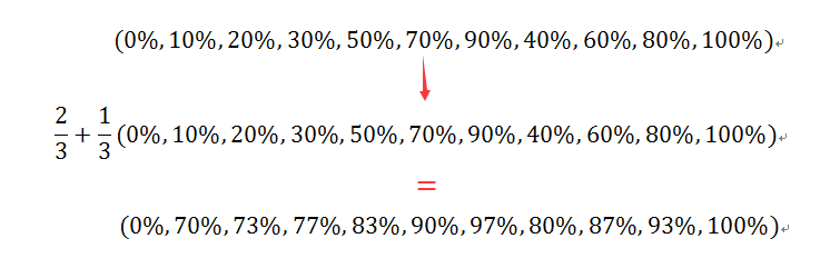
将动画总时长变成3s,用计算出的百分比替换原来的百分比,代码如下:
.ico{
    -webkit-animation: Tada 3s both infinite;
    -moz-animation: Tada 3s both infinite;
    -ms-animation: Tada 3s both infinite;
    animation: Tada 3s both infinite;
}
@keyframes Tada {
    0% {
        transform: scale(1);
        transform: scale(1)
    }

    70%,73%{
        transform: scale(0.9) rotate(-3deg);
        transform: scale(0.9) rotate(-3deg)
    }

    77%,83%,90%,97%  {
        transform: scale(1.1) rotate(3deg);
        transform: scale(1.1) rotate(3deg)
    }

    80%,87%,93%{
        transform: scale(1.1) rotate(-3deg);
        transform: scale(1.1) rotate(-3deg)
    }

    100% {
        transform: scale(1) rotate(0);
        transform: scale(1) rotate(0)
    }
}
效果就是我们期望的了。

完整代码如下:
<!DOCTYPE html>
<html lang="en">

<head>
    <meta charset="UTF-8">
    <title>demo of starof</title>
    <style>
    a {
        display: inline-block;
        background-color: #cc2222;
        text-decoration: none;
        color: #fff;
        font-size: 14px;
        padding: 10px 12px;
        width: 100px;
        position: relative;
    }

    .ico {
        position: absolute;
        width: 14px;
        height: 16px;
        background: url(images/ico.png) no-repeat center;
        background-size: 100%;
        position: absolute;
        top: 4px;
        right: 27px;
    }
    /*动画*/
    .ico{
    -webkit-animation: Tada 3s both infinite;
    -moz-animation: Tada 3s both infinite;
    -ms-animation: Tada 3s both infinite;
    animation: Tada 3s both infinite;
}
@-webkit-keyframes Tada {
    0% {
        -webkit-transform: scale(1);
        transform: scale(1)
    }

    70%,73% {
        -webkit-transform: scale(0.9) rotate(-3deg);
        transform: scale(0.9) rotate(-3deg)
    }

    77%,83%,90%,97% {
        -webkit-transform: scale(1.1) rotate(3deg);
        transform: scale(1.1) rotate(3deg)
    }

    80%,87%,93% {
        -webkit-transform: scale(1.1) rotate(-3deg);
        transform: scale(1.1) rotate(-3deg)
    }

    100% {
        -webkit-transform: scale(1) rotate(0);
        transform: scale(1) rotate(0)
    }
}

@-moz-keyframes Tada {
    0% {
        -moz-transform: scale(1);
        transform: scale(1)
    }

    70%,73% {
        -moz-transform: scale(0.9) rotate(-3deg);
        transform: scale(0.9) rotate(-3deg)
    }

    77%,83%,90%,97% {
        -moz-transform: scale(1.1) rotate(3deg);
        transform: scale(1.1) rotate(3deg)
    }

    80%,87%,93%{
        -moz-transform: scale(1.1) rotate(-3deg);
        transform: scale(1.1) rotate(-3deg)
    }

    100% {
        -moz-transform: scale(1) rotate(0);
        transform: scale(1) rotate(0)
    }
}

@-ms-keyframes Tada {
    0% {
        -ms-transform: scale(1);
        transform: scale(1)
    }

    70%,73% {
        -ms-transform: scale(0.9) rotate(-3deg);
        transform: scale(0.9) rotate(-3deg)
    }

    77%,83%,90%,97% {
        -ms-transform: scale(1.1) rotate(3deg);
        transform: scale(1.1) rotate(3deg)
    }

    80%,87%,93% {
        -ms-transform: scale(1.1) rotate(-3deg);
        transform: scale(1.1) rotate(-3deg)
    }

    100% {
        -ms-transform: scale(1) rotate(0);
        transform: scale(1) rotate(0)
    }
}

@keyframes Tada {
    0% {
        transform: scale(1);
        transform: scale(1)
    }

    70%,73%{
        transform: scale(0.9) rotate(-3deg);
        transform: scale(0.9) rotate(-3deg)
    }

    77%,83%,90%,97%  {
        transform: scale(1.1) rotate(3deg);
        transform: scale(1.1) rotate(3deg)
    }

    80%,87%,93%{
        transform: scale(1.1) rotate(-3deg);
        transform: scale(1.1) rotate(-3deg)
    }

    100% {
        transform: scale(1) rotate(0);
        transform: scale(1) rotate(0)
    }
}

    </style>
</head>

<body>
    <nav>
        <a href="javascript:;" class="box">
                            一元夺宝
                            <div class="ico"></div>
        </a>
    </nav>
</body>

</html>
本文只是介绍一种思路,关于动画各个参数详情可参考:
本文作者starof,因知识本身在变化,作者也在不断学习成长,文章内容也不定时更新,为避免误导读者,方便追根溯源,请诸位转载注明出处:http://www.cnblogs.com/starof/p/5443445.html有问题欢迎与我讨论,共同进步。