1. 概述
来看看这段XMAL:
<StackPanel Width="300">
    <TextBox Header="TextBox" />
    <ComboBox Header="ComboBox" HorizontalAlignment="Stretch"/>
    <AutoSuggestBox Header="AutoSuggestBox" />
    <TextBlock Text="ListBox" />
    <ListBox>
        <ListBoxItem Content="ListBoxItem 1" />
        <ListBoxItem Content="ListBoxItem 2" />
        <ListBoxItem Content="ListBoxItem 3" />
    </ListBox>
</StackPanel>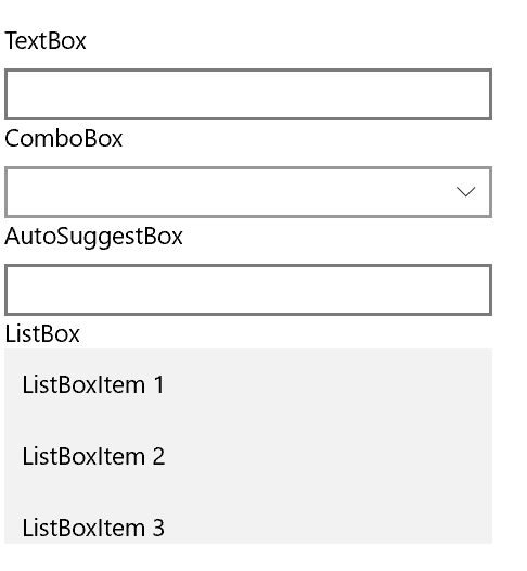
是不是觉得它们中出了一个叛徒?这个示例中除了ListBox控件其它都自带Header,但是ListBox没有Header属性,只好用一个TextBlock模仿它的Header。这样就带来一个问题:只有ListBox的Header高度和其它控件不一致。
既然现在讨论的是自定义控件,这里就用自定义控件的方式解决这个问题。首先想到最简单的方法,就是自定义一个HeaderedContentControl,如名字所示,这个控件继承自ContentControl并拥有Header属性,用起来大概是这样:
<HeaderedContentControl Header="ListBox">
    <ListBox/>
</HeaderedContentControl>
这样,只要在HeaderedContentControl的样式中模仿其它含Header属性的控件,就能统一Header的外观。
WPF中本来就有这个控件,它是Expander、GroupBox、TabItem等诸多拥有Header属性的控件的基类,十分方便好用。UWP中模仿这个控件很简单,而且很适合用来学习自定义控件的进阶知识。
2. 定义HeaderedContentControl结构
比起WPF,借鉴Silverlight的HeaderedContentControl比较好,因为Silverlight的比较简单。HeaderedContentControl只需要在继承ContentControl后添加两个属性:Header和HeaderTemplate。
public class HeaderedContentControl : ContentControl
{
    public HeaderedContentControl()
    {
        this.DefaultStyleKey = typeof(HeaderedContentControl);
    }

    /// <summary>
    /// 获取或设置Header的值
    /// </summary>
    public object Header
    {
        get { return (object)GetValue(HeaderProperty); }
        set { SetValue(HeaderProperty, value); }
    }

    /// <summary>
    /// 标识 Header 依赖属性。
    /// </summary>
    public static readonly DependencyProperty HeaderProperty =
        DependencyProperty.Register("Header", typeof(object), typeof(HeaderedContentControl), new PropertyMetadata(null, OnHeaderChanged));

    private static void OnHeaderChanged(DependencyObject obj, DependencyPropertyChangedEventArgs args)
    {
        HeaderedContentControl target = obj as HeaderedContentControl;
        object oldValue = (object)args.OldValue;
        object newValue = (object)args.NewValue;
        if (oldValue != newValue)
            target.OnHeaderChanged(oldValue, newValue);
    }

    /// <summary>
    /// 获取或设置HeaderTemplate的值
    /// </summary>
    public DataTemplate HeaderTemplate
    {
        get { return (DataTemplate)GetValue(HeaderTemplateProperty); }
        set { SetValue(HeaderTemplateProperty, value); }
    }

    /// <summary>
    /// 标识 HeaderTemplate 依赖属性。
    /// </summary>
    public static readonly DependencyProperty HeaderTemplateProperty =
        DependencyProperty.Register("HeaderTemplate", typeof(DataTemplate), typeof(HeaderedContentControl), new PropertyMetadata(null, OnHeaderTemplateChanged));

    private static void OnHeaderTemplateChanged(DependencyObject obj, DependencyPropertyChangedEventArgs args)
    {
        HeaderedContentControl target = obj as HeaderedContentControl;
        DataTemplate oldValue = (DataTemplate)args.OldValue;
        DataTemplate newValue = (DataTemplate)args.NewValue;
        if (oldValue != newValue)
            target.OnHeaderTemplateChanged(oldValue, newValue);
    }

    protected virtual void OnHeaderChanged(object oldValue, object newValue)
    {
    }

    protected virtual void OnHeaderTemplateChanged(DataTemplate oldValue, DataTemplate newValue)
    {
    }
}
3. 设计样式
在C:\Program Files (x86)\Windows Kits\10\DesignTime\CommonConfiguration\Neutral\UAP\10.0.14393.0\Generic\generic.xaml中找到ContentControl的样式。
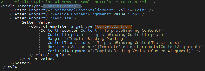
再从TextBox的Style中找到HeaderContentPresenter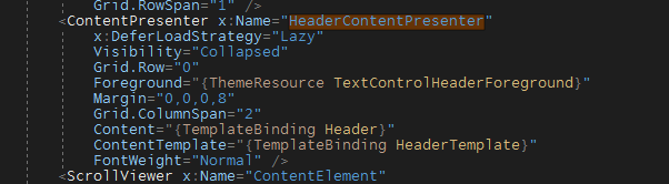
提示: 随便找个有ThemeResource的XAML,譬如
Grid Background="{ThemeResource ApplicationPageBackgroundThemeBrush}",在资源名称(ApplicationPageBackgroundThemeBrush)上按"F12",即可导航到存放ThemeResource的generic.xaml。
组合起来,HeaderedContentControl的默认样式就完成了。
<Style TargetType="local:HeaderedContentControl">
    <Setter Property="HorizontalContentAlignment"
            Value="Left" />
    <Setter Property="VerticalContentAlignment"
            Value="Top" />
    <Setter Property="Template">
        <Setter.Value>
            <ControlTemplate TargetType="local:HeaderedContentControl">
                <StackPanel>
                    <ContentPresenter x:Name="HeaderContentPresenter"
                                      Foreground="{ThemeResource TextControlHeaderForeground}"
                                      Margin="0,0,0,8"
                                      Content="{TemplateBinding Header}"
                                      ContentTemplate="{TemplateBinding HeaderTemplate}"
                                      FontWeight="Normal" />
                    <ContentPresenter Content="{TemplateBinding Content}"
                                      ContentTemplate="{TemplateBinding ContentTemplate}"
                                      Margin="{TemplateBinding Padding}"
                                      ContentTransitions="{TemplateBinding ContentTransitions}"
                                      HorizontalAlignment="{TemplateBinding HorizontalContentAlignment}"
                                      VerticalAlignment="{TemplateBinding VerticalContentAlignment}" />
                </StackPanel>
            </ControlTemplate>
        </Setter.Value>
    </Setter>
</Style>
4. 使用
 <StackPanel Visibility="Collapsed">
    <TextBox Header="TextBox" />
    <ComboBox Header="ComboBox"
              HorizontalAlignment="Stretch" />
    <AutoSuggestBox Header="AutoSuggestBox" />
    <local:HeaderedContentControl Header="ListBox">
        <ListBox>
            <ListBoxItem Content="ListBoxItem 1" />
            <ListBoxItem Content="ListBoxItem 2" />
            <ListBoxItem Content="ListBoxItem 3" />
        </ListBox>
    </local:HeaderedContentControl>
</StackPanel>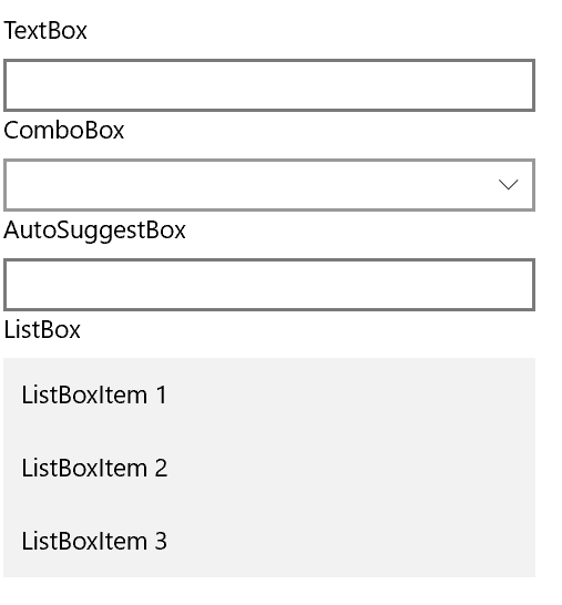
调用代码及效果。这样外观就统一了。
注意: 我移除了 x:DeferLoadStrategy="Lazy"这句,这个知识点比较适合放在有关性能的主题里讨论。