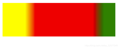
To display a gradient fill
-
第一步:In Visual Studio, create a Smart Device project.
-
第二部:Add the Gradientfill and GradientFilledButton classes to your project.
-
-
-
public sealed class GradientFill
{
// This method wraps the PInvoke to GradientFill.
// Parmeters:
// gr - The Graphics object we are filling
// rc - The rectangle to fill
// startColor - The starting color for the fill
// endColor - The ending color for the fill
// fillDir - The direction to fill
//
// Returns true if the call to GradientFill succeeded; false
// otherwise.
public static bool Fill(
Graphics gr,
Rectangle rc,
Color startColor, Color endColor,
FillDirection fillDir)
{
// Initialize the data to be used in the call to GradientFill.
Win32Helper.TRIVERTEX[] tva = new Win32Helper.TRIVERTEX[2];
tva[0] = new Win32Helper.TRIVERTEX(rc.X, rc.Y, startColor);
tva[1] = new Win32Helper.TRIVERTEX(rc.Right, rc.Bottom, endColor);
Win32Helper.GRADIENT_RECT[] gra = new Win32Helper.GRADIENT_RECT[] {
new Win32Helper.GRADIENT_RECT(0, 1)};
// Get the hDC from the Graphics object.
IntPtr hdc = gr.GetHdc();
// PInvoke to GradientFill.
bool b;
b = Win32Helper.GradientFill(
hdc,
tva,
(uint)tva.Length,
gra,
(uint)gra.Length,
(uint)fillDir);
System.Diagnostics.Debug.Assert(b, string.Format(
"GradientFill failed: {0}",
System.Runtime.InteropServices.Marshal.GetLastWin32Error()));
// Release the hDC from the Graphics object.
gr.ReleaseHdc(hdc);
return b;
}
// The direction to the GradientFill will follow
public enum FillDirection
{
//
// The fill goes horizontally
//
LeftToRight = Win32Helper.GRADIENT_FILL_RECT_H,
//
// The fill goes vertically
//
TopToBottom = Win32Helper.GRADIENT_FILL_RECT_V
}
}
// Extends the standard button control and performs
// custom drawing with a GradientFill background.
public class GradientFilledButton : Control
{
private System.ComponentModel.IContainer components = null;
public GradientFilledButton()
{
components = new System.ComponentModel.Container();
this.Font = new Font(this.Font.Name, this.Font.Size, FontStyle.Bold);
}
// Controls the direction in which the button is filled.
public GradientFill.FillDirection FillDirection
{
get
{
return fillDirectionValue;
}
set
{
fillDirectionValue = value;
Invalidate();
}
}
private GradientFill.FillDirection fillDirectionValue;
// The start color for the GradientFill. This is the color
// at the left or top of the control depeneding on the value
// of the FillDirection property.
public Color StartColor
{
get { return startColorValue; }
set
{
startColorValue = value;
Invalidate();
}
}
private Color startColorValue = Color.Red;
// The end color for the GradientFill. This is the color
// at the right or bottom of the control depending on the value
// of the FillDirection property
public Color EndColor
{
get { return endColorValue; }
set
{
endColorValue = value;
Invalidate();
}
}
private Color endColorValue = Color.Blue;
// This is the offset from the left or top edge
// of the button to start the gradient fill.
public int StartOffset
{
get { return startOffsetValue; }
set
{
startOffsetValue = value;
Invalidate();
}
}
private int startOffsetValue;
// This is the offset from the right or bottom edge
// of the button to end the gradient fill.
public int EndOffset
{
get { return endOffsetValue; }
set
{
endOffsetValue = value;
Invalidate();
}
}
private int endOffsetValue;
// Used to double-buffer our drawing to avoid flicker
// between painting the background, border, focus-rect
// and the text of the control.
private Bitmap DoubleBufferImage
{
get
{
if (bmDoubleBuffer == null)
bmDoubleBuffer = new Bitmap(
this.ClientSize.Width,
this.ClientSize.Height);
return bmDoubleBuffer;
}
set
{
if (bmDoubleBuffer != null)
bmDoubleBuffer.Dispose();
bmDoubleBuffer = value;
}
}
private Bitmap bmDoubleBuffer;
// Called when the control is resized. When that happens,
// recreate the bitmap used for double-buffering.
protected override void OnResize(EventArgs e)
{
DoubleBufferImage = new Bitmap(
this.ClientSize.Width,
this.ClientSize.Height);
base.OnResize(e);
}
// Called when the control gets focus. Need to repaint
// the control to ensure the focus rectangle is drawn correctly.
protected override void OnGotFocus(EventArgs e)
{
base.OnGotFocus(e);
this.Invalidate();
}
//
// Called when the control loses focus. Need to repaint
// the control to ensure the focus rectangle is removed.
protected override void OnLostFocus(EventArgs e)
{
base.OnLostFocus(e);
this.Invalidate();
}
protected override void OnMouseMove(MouseEventArgs e)
{
if (this.Capture)
{
Point coord = new Point(e.X, e.Y);
if (this.ClientRectangle.Contains(coord) !=
this.ClientRectangle.Contains(lastCursorCoordinates))
{
DrawButton(this.ClientRectangle.Contains(coord));
}
lastCursorCoordinates = coord;
}
base.OnMouseMove(e);
}
// The coordinates of the cursor the last time
// there was a MouseUp or MouseDown message.
Point lastCursorCoordinates;
protected override void OnMouseDown(MouseEventArgs e)
{
if (e.Button == MouseButtons.Left)
{
// Start capturing the mouse input
this.Capture = true;
// Get the focus because button is clicked.
this.Focus();
// draw the button
DrawButton(true);
}
base.OnMouseDown(e);
}
protected override void OnMouseUp(MouseEventArgs e)
{
this.Capture = false;
DrawButton(false);
base.OnMouseUp(e);
}
bool bGotKeyDown = false;
protected override void OnKeyDown(KeyEventArgs e)
{
bGotKeyDown = true;
switch (e.KeyCode)
{
case Keys.Space:
case Keys.Enter:
DrawButton(true);
break;
case Keys.Up:
case Keys.Left:
this.Parent.SelectNextControl(this, false, false, true, true);
break;
case Keys.Down:
case Keys.Right:
this.Parent.SelectNextControl(this, true, false, true, true);
break;
default:
bGotKeyDown = false;
base.OnKeyDown(e);
break;
}
}
protected override void OnKeyUp(KeyEventArgs e)
{
switch (e.KeyCode)
{
case Keys.Space:
case Keys.Enter:
if (bGotKeyDown)
{
DrawButton(false);
OnClick(EventArgs.Empty);
bGotKeyDown = false;
}
break;
default:
base.OnKeyUp(e);
break;
}
}
// Override this method with no code to avoid flicker.
protected override void OnPaintBackground(PaintEventArgs e)
{
}
protected override void OnPaint(PaintEventArgs e)
{
DrawButton(e.Graphics, this.Capture &&
(this.ClientRectangle.Contains(lastCursorCoordinates)));
}
//
// Gets a Graphics object for the provided window handle
// and then calls DrawButton(Graphics, bool).
//
// If pressed is true, the button is drawn
// in the depressed state.
void DrawButton(bool pressed)
{
Graphics gr = this.CreateGraphics();
DrawButton(gr, pressed);
gr.Dispose();
}
// Draws the button on the specified Grapics
// in the specified state.
//
// Parameters:
// gr - The Graphics object on which to draw the button.
// pressed - If true, the button is drawn in the depressed state.
void DrawButton(Graphics gr, bool pressed)
{
// Get a Graphics object from the background image.
Graphics gr2 = Graphics.FromImage(DoubleBufferImage);
// Fill solid up until where the gradient fill starts.
if (startOffsetValue > 0)
{
if (fillDirectionValue ==
GradientFill.FillDirection.LeftToRight)
{
gr2.FillRectangle(
new SolidBrush(pressed ? EndColor : StartColor),
0, 0, startOffsetValue, Height);
}
else
{
gr2.FillRectangle(
new SolidBrush(pressed ? EndColor : StartColor),
0, 0, Width, startOffsetValue);
}
}
// Draw the gradient fill.
Rectangle rc = this.ClientRectangle;
if (fillDirectionValue == GradientFill.FillDirection.LeftToRight)
{
rc.X = startOffsetValue;
rc.Width = rc.Width - startOffsetValue - endOffsetValue;
}
else
{
rc.Y = startOffsetValue;
rc.Height = rc.Height - startOffsetValue - endOffsetValue;
}
GradientFill.Fill(
gr2,
rc,
pressed ? endColorValue : startColorValue,
pressed ? startColorValue : endColorValue,
fillDirectionValue);
// Fill solid from the end of the gradient fill
// to the edge of the button.
if (endOffsetValue > 0)
{
if (fillDirectionValue ==
GradientFill.FillDirection.LeftToRight)
{
gr2.FillRectangle(
new SolidBrush(pressed ? StartColor : EndColor),
rc.X + rc.Width, 0, endOffsetValue, Height);
}
else
{
gr2.FillRectangle(
new SolidBrush(pressed ? StartColor : EndColor),
0, rc.Y + rc.Height, Width, endOffsetValue);
}
}
// Draw the text.
StringFormat sf = new StringFormat();
sf.Alignment = StringAlignment.Center;
sf.LineAlignment = StringAlignment.Center;
gr2.DrawString(this.Text, this.Font,
new SolidBrush(this.ForeColor),
this.ClientRectangle, sf);
// Draw the border.
// Need to shrink the width and height by 1 otherwise
// there will be no border on the right or bottom.
rc = this.ClientRectangle;
rc.Width--;
rc.Height--;
Pen pen = new Pen(SystemColors.WindowFrame);
gr2.DrawRectangle(pen, rc);
// Draw from the background image onto the screen.
gr.DrawImage(DoubleBufferImage, 0, 0);
gr2.Dispose();
}
protected override void Dispose(bool disposing)
{
if (disposing && (components != null))
{
components.Dispose();
}
base.Dispose(disposing);
}
}
第三步:Add the Win32Helper class to your project, which contains the platform invoke and structures for native code interoperability.
public sealed class Win32Helper { public struct TRIVERTEX {
public int x; public int y;
public ushort Red; public ushort Green; public ushort Blue;
public ushort Alpha; public TRIVERTEX(int x, int y, Color color) :
this(x, y, color.R, color.G, color.B, color.A) { }
public TRIVERTEX( int x, int y, ushort red, ushort green, ushort blue, ushort alpha) { ]
this.x = x; this.y = y; this.Red = (ushort)(red << 8);
this.Green = (ushort)(green << 8);
this.Blue = (ushort)(blue << 8);
this.Alpha = (ushort)(alpha << 8); } }
public struct GRADIENT_RECT {
public uint UpperLeft; public uint LowerRight;
public GRADIENT_RECT(uint ul, uint lr) {
this.UpperLeft = ul; this.LowerRight = lr; } }
[DllImport("coredll.dll", SetLastError = true, EntryPoint = "GradientFill")]
public extern static bool GradientFill( IntPtr hdc, TRIVERTEX[] pVertex, uint dwNumVertex, GRADIENT_RECT[] pMesh, uint dwNumMesh, uint dwMode);
public const int GRADIENT_FILL_RECT_H = 0x00000000;
public const int GRADIENT_FILL_RECT_V = 0x00000001; }
第四步:Declare a form variable named gfButton of type GradientFilledButton.
private GradientFilledButton gfButton;
第五步:Add the following code, which initializes the gradient filled button custom control, to the constructor of the Form1 class. This code should follow the call to the InitializeComponent method. You can specify the start and ending colors of the gradient fill and either a TopToBottom or LeftToRight fill direction.
InitializeComponent(); this.gfButton = new GradientFilledButton();
this.gfButton.Location = new System.Drawing.Point(71, 24);
this.gfButton.Name = "gfButton";
this.gfButton.Size = new System.Drawing.Size(100, 23);
this.gfButton.TabIndex = 1; this.gfButton.Text = "Button Test";
this.gfButton.Click += new System.EventHandler(this.gfButton_Click);
// Select desired start color, end color, and fill direction.
this.gfButton.StartColor = System.Drawing.Color.SlateBlue;
this.gfButton.EndColor = System.Drawing.Color.LightCyan;
gfButton.FillDirection = GradientFill.FillDirection.LeftToRight;
this.Controls.Add(gfButton);
第六步:Add the event handling code for the button's Click event to form.
void gfButton_Click(object sender, System.EventArgs e) {
Control control = sender as Control;
System.Diagnostics.Debug.Assert(control != null);
MessageBox.Show("Clicked", "Click event handler"); }
第七步:Override the OnPaint method to paint the background of the form with a gradient fill pattern. This code uses the GradientFill class but not the GradientFilledButton class.
protected override void OnPaintBackground(PaintEventArgs e)
{
// On Windows Mobile Pocket PC 2003, the call to GradientFill
// fails with GetLastError() returning 87 (ERROR_INVALID_PARAMETER)
// when e.Graphics is used.
// Instead, fill into a bitmap and then draw that onto e.Graphics.
Bitmap bm = new Bitmap(Width, Height);
Graphics gr = System.Drawing.Graphics.FromImage(bm);
GradientFill.Fill(
gr,
this.ClientRectangle,
Color.LightCyan, Color.SlateBlue,
GradientFill.FillDirection.TopToBottom);
e.Graphics.DrawImage(bm, 0, 0);
gr.Dispose();
bm.Dispose();
}
第八步:Build and deploy the application.
本文转自xyz_lmn51CTO博客,原文链接:http://blog.51cto.com/xyzlmn/819955,如需转载请自行联系原作者