欢迎转载,转载请注明:转载自周金根 [ http://zhoujg.cnblogs.com/ ]
由于上周主要做了项目组产品架构、给公司新员工培训以及其他会议等事情,在OpenExpressApp对建模支持的初步计划中我列了一些建模任务还没有开展,其中参考部分在以前的blog中都已经介绍了(MetaModelEngine:元模型引擎开发思路、DSM:使用MetaEdit+编写Family Tree Modeling Language、读书笔记:Visual Studio DSL工具特定领域开发指南)。今天手头上没有其他重要事情了,可以开始进行学习WPF的图形设计器了,这也就是我在WPF - 图形设计器(Diagram Designer)中介绍的一个有源码的设计器,以前看过,觉得它已经实现了图形设计器的一些基本功能,只要先学会它就应该可以编写出自己的一个简易设计器。这个系列分为四部分,每部分都是在原有基础上扩展一些设计器功能,我也将分为四篇blog把从中学到的内容整理一下,对WPF和设计器感兴趣的可以看看。
WPF Diagram Designer: Part 1
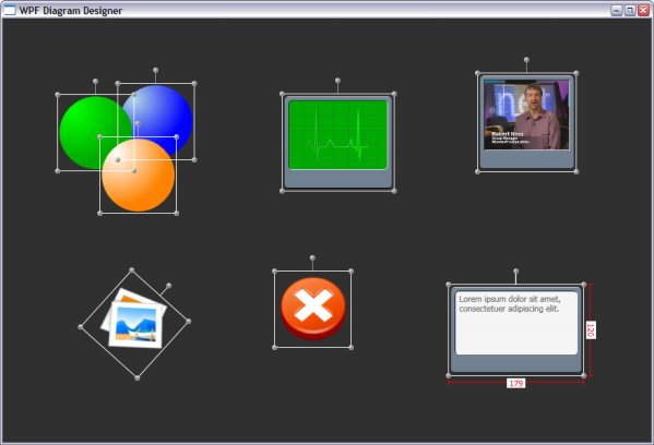
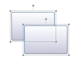
这篇文章介绍了通过WPF的控件模板以及Thumb来实现图形设计器的移动Drag、改变大小resize和旋转rotate这三个几本功能,示例代码界面如下:
控件模板
以往我们在使用Window下的控件时,都是通过控件本身提供的很多属性来更改外观,而在WPF下,你会发现控件并没有提供太多的定制属性,这是因为WPF把外观和内容隔离开来,通过控件模板的概念让我们可以更方便、更有想象力的来定制我们需要的界面。模板可以允许我们用任何东西来完全替代一个元素的可视树,但控件本身的其他功能并不受影响。WPF中的每个Control的默认外观都是在模板中定义的,大家可以通过我以前说的这个工具来查看WPF - 模板查看工具:Show Me The Template及如何查看第三方主题
控件模板由ControlTemplate类来表示,它派生自FrameworkTemplate抽象类,它的重要部分是它的VisualTree内容属性,它包含了定义想要的外观的可视树。通过以下方式可以定义一个控件模板类:

< Canvas.Resources >
< ControlTemplate x:Key = " DesignerItemTemplate " TargetType = " ContentControl " >
< ContentPresenter Content = " {TemplateBinding ContentControl.Content} " />
</ ControlTemplate >
</ Canvas.Resources >
< ContentControl Name = " DesignerItem "
Width = " 100 "
Height = " 100 "
Canvas.Top = " 100 "
Canvas.Left = " 100 "
Template = " {StaticResource DesignerItemTemplate} " >
< Ellipse Fill = " Blue " />
</ ContentControl >
</ Canvas >
- 限制目标类型
ControlTemplate和Style一样,也有一个TargetType属性来限制模板可以被应用到的类型上,如果没有一个显示的TargetType,则目标类型将被隐式的设置为Control。由于没有默认的控件模板,所以它与Style是不同的,当使用TargetType时不允许移除模板的x:Key。 - 模板绑定TemplateBinding
在控件模板中,从目标元素插入属性值的关键是数据绑定,我们可以通过一个简单、轻量级的模板绑定TemplateBinding来处理。TemplateBinding的数据源总是目标元素,而Path则是目标元素的任何一个依赖属性。使用方式如上例的{TemplateBinding ContentControl.Content},如果我们设置了TargetType,可以更简单的使用为{TemplateBinding Content}
TemplateBinding仅仅是一个便捷的设置模板绑定的机制,对于有些可冻结的属性(如Brush的Color属性)时绑定会失败,这时候我们可以使用常规的Binding来达到同样效果,通过使用一个RelativeSource,其值为{Relative Source TemplatedParent}以及一个Path。 - ContentPresenter
在控件模板中应该使用轻量级的内容显示元素ContentPresenter,而不是ContentControl。ContentPresenter显示的内容和ContentControl是一样的,但是ContentControl是一个带有控件模板的成熟控件,其内部包含了ContentPresenter。
如果我们在使用ContentPresenter时忘记了将它的Content设置为{TemplateBinding Content}时,它将隐式的假设{TemplateBinding Content}就是我们需要的内容 - 与触发器交互
在模板内部可以使用触发器,但是在进行绑定时需要注意只能使用Binding,因为触发器位于控件可视树模板外部
Thumb
在WPF中有一个Thumb的控件,在MSDN文档中是这么写的: " ...represents a control that lets the user drag and resize controls." 从字面上来看这个是一个用来处理拖放和设置大小的控件,正好应该在图形设计器中来处理移动和改变大小等动作。在以下介绍的Move、Resize和Rotate这三个功能都是使用Thumb来做的。
移动(Move)
MoveThumb 是从Thumb继承下来,我们实现了DragDelta事件来处理移动操作,

 代码
代码
{
public MoveThumb()
{
DragDelta += new DragDeltaEventHandler( this .MoveThumb_DragDelta);
}
private void MoveThumb_DragDelta( object sender, DragDeltaEventArgs e)
{
ContentControl designerItem = DataContext as ContentControl;
if (designerItem != null )
{
Point dragDelta = new Point(e.HorizontalChange, e.VerticalChange);
RotateTransform rotateTransform = designerItem.RenderTransform as RotateTransform;
if (rotateTransform != null )
{
dragDelta = rotateTransform.Transform(dragDelta);
}
Canvas.SetLeft(designerItem, Canvas.GetLeft(designerItem) + dragDelta.X);
Canvas.SetTop(designerItem, Canvas.GetTop(designerItem) + dragDelta.Y);
}
}
}
实现代码中假定DataContext为我们需要操作的图形控件,这个可以在控件模板中看到:
< Grid >
< s:DragThumb DataContext = " {Binding RelativeSource={RelativeSource TemplatedParent}} " Cursor = " SizeAll " />
< ContentPresenter Content = " {TemplateBinding ContentControl.Content} " />
</ Grid >
</ ControlTemplate >
-
RelativeSource
- PreviousData 列表的前一个数据项
- TemplatedParent 应用模板的元素
- Self 元素自身
- FindAncestor 通过父元素链去找
-
命中测试 IsHitTestVisible
如果我们现在拖动一个圆形,那么界面如下: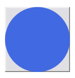
我们现在拖动时会发现,只能在灰色部分才允许拖动,在圆形区域由于捕获的不是MoveThumb而不能拖动。这时候我们只需要简单的设置IsHitTest为false即可< Ellipse Fill = " Blue " IsHitTestVisible = " False " />
Resize
更改大小仍旧使用的是Thumb,我们建立了一个控件模板:
< Grid >
< Thumb Height = " 3 " Cursor = " SizeNS " Margin = " 0 -4 0 0 "
VerticalAlignment = " Top " HorizontalAlignment = " Stretch " />
< Thumb Width = " 3 " Cursor = " SizeWE " Margin = " -4 0 0 0 "
VerticalAlignment = " Stretch " HorizontalAlignment = " Left " />
< Thumb Width = " 3 " Cursor = " SizeWE " Margin = " 0 0 -4 0 "
VerticalAlignment = " Stretch " HorizontalAlignment = " Right " />
< Thumb Height = " 3 " Cursor = " SizeNS " Margin = " 0 0 0 -4 "
VerticalAlignment = " Bottom " HorizontalAlignment = " Stretch " />
< Thumb Width = " 7 " Height = " 7 " Cursor = " SizeNWSE " Margin = " -6 -6 0 0 "
VerticalAlignment = " Top " HorizontalAlignment = " Left " />
< Thumb Width = " 7 " Height = " 7 " Cursor = " SizeNESW " Margin = " 0 -6 -6 0 "
VerticalAlignment = " Top " HorizontalAlignment = " Right " />
< Thumb Width = " 7 " Height = " 7 " Cursor = " SizeNESW " Margin = " -6 0 0 -6 "
VerticalAlignment = " Bottom " HorizontalAlignment = " Left " />
< Thumb Width = " 7 " Height = " 7 " Cursor = " SizeNWSE " Margin = " 0 0 -6 -6 "
VerticalAlignment = " Bottom " HorizontalAlignment = " Right " />
</ Grid >
</ ControlTemplate >
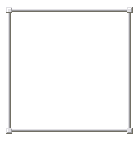
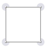
设置了这个样式的Control界面如下图所示:
对于改变大小,我们只要按照MoveThumb一样,从Thumb继承一个ResizeThumb来处理改变大小的动作,对于控件模板,我们只要把上面的Thumb替换成ResizeThumb即可
代码
{
public ResizeThumb()
{
DragDelta += new DragDeltaEventHandler( this .ResizeThumb_DragDelta);
}
private void ResizeThumb_DragDelta( object sender, DragDeltaEventArgs e)
{
Control item = this .DataContext as Control;
if (item != null )
{
double deltaVertical, deltaHorizontal;
switch (VerticalAlignment)
{
case VerticalAlignment.Bottom:
deltaVertical = Math.Min( - e.VerticalChange,
item.ActualHeight - item.MinHeight);
item.Height -= deltaVertical;
break ;
case VerticalAlignment.Top:
deltaVertical = Math.Min(e.VerticalChange,
item.ActualHeight - item.MinHeight);
Canvas.SetTop(item, Canvas.GetTop(item) + deltaVertical);
item.Height -= deltaVertical;
break ;
default :
break ;
}
switch (HorizontalAlignment)
{
case HorizontalAlignment.Left:
deltaHorizontal = Math.Min(e.HorizontalChange,
item.ActualWidth - item.MinWidth);
Canvas.SetLeft(item, Canvas.GetLeft(item) + deltaHorizontal);
item.Width -= deltaHorizontal;
break ;
case HorizontalAlignment.Right:
deltaHorizontal = Math.Min( - e.HorizontalChange,
item.ActualWidth - item.MinWidth);
item.Width -= deltaHorizontal;
break ;
default :
break ;
}
}
e.Handled = true ;
}
}
- 加入到DesignerItemTemplate控件模板
< ControlTemplate x:Key = " DesignerItemTemplate " TargetType = " ContentControl " >
< Grid DataContext = " {Binding RelativeSource={RelativeSource TemplatedParent}} " >
< s:MoveThumb Template = " {StaticResource MoveThumbTemplate} " Cursor = " SizeAll " />
< Control Template = " {StaticResource ResizeDecoratorTemplate} " />
< ContentPresenter Content = " {TemplateBinding ContentControl.Content} " />
</ Grid >
</ ControlTemplate >
Rotate
我们实现旋转功能,仍旧是通过从Thumb继承下来一个RotateThumb,具体实现代码如下:
代码
{
private double initialAngle;
private RotateTransform rotateTransform;
private Vector startVector;
private Point centerPoint;
private ContentControl designerItem;
private Canvas canvas;
public RotateThumb()
{
DragDelta += new DragDeltaEventHandler( this .RotateThumb_DragDelta);
DragStarted += new DragStartedEventHandler( this .RotateThumb_DragStarted);
}
private void RotateThumb_DragStarted( object sender, DragStartedEventArgs e)
{
this .designerItem = DataContext as ContentControl;
if ( this .designerItem != null )
{
this .canvas = VisualTreeHelper.GetParent( this .designerItem) as Canvas;
if ( this .canvas != null )
{
this .centerPoint = this .designerItem.TranslatePoint(
new Point( this .designerItem.Width * this .designerItem.RenderTransformOrigin.X,
this .designerItem.Height * this .designerItem.RenderTransformOrigin.Y),
this .canvas);
Point startPoint = Mouse.GetPosition( this .canvas);
this .startVector = Point.Subtract(startPoint, this .centerPoint);
this .rotateTransform = this .designerItem.RenderTransform as RotateTransform;
if ( this .rotateTransform == null )
{
this .designerItem.RenderTransform = new RotateTransform( 0 );
this .initialAngle = 0 ;
}
else
{
this .initialAngle = this .rotateTransform.Angle;
}
}
}
}
private void RotateThumb_DragDelta( object sender, DragDeltaEventArgs e)
{
if ( this .designerItem != null && this .canvas != null )
{
Point currentPoint = Mouse.GetPosition( this .canvas);
Vector deltaVector = Point.Subtract(currentPoint, this .centerPoint);
double angle = Vector.AngleBetween( this .startVector, deltaVector);
RotateTransform rotateTransform = this .designerItem.RenderTransform as RotateTransform;
rotateTransform.Angle = this .initialAngle + Math.Round(angle, 0 );
this .designerItem.InvalidateMeasure();
}
}
样式如下:
代码
< Style TargetType = " {x:Type s:RotateThumb} " >
< Setter Property = " RenderTransformOrigin " Value = " 0.5,0.5 " />
< Setter Property = " Cursor " Value = " Hand " />
< Setter Property = " Control.Template " >
< Setter.Value >
< ControlTemplate TargetType = " {x:Type s:RotateThumb} " >
< Grid Width = " 30 " Height = " 30 " >
< Path Fill = " #AAD0D0DD "
Stretch = " Fill "
Data = " M 50,100 A 50,50 0 1 1 100,50 H 50 V 100 " />
</ Grid >
</ ControlTemplate >
</ Setter.Value >
</ Setter >
</ Style >
<!-- RotateDecorator Template -->
< ControlTemplate x:Key = " RotateDecoratorTemplate " TargetType = " {x:Type Control} " >
< Grid >
< s:RotateThumb Margin = " -18,-18,0,0 " VerticalAlignment = " Top " HorizontalAlignment = " Left " />
< s:RotateThumb Margin = " 0,-18,-18,0 " VerticalAlignment = " Top " HorizontalAlignment = " Right " >
< s:RotateThumb.RenderTransform >
< RotateTransform Angle = " 90 " />
</ s:RotateThumb.RenderTransform >
</ s:RotateThumb >
< s:RotateThumb Margin = " 0,0,-18,-18 " VerticalAlignment = " Bottom " HorizontalAlignment = " Right " >
< s:RotateThumb.RenderTransform >
< RotateTransform Angle = " 180 " />
</ s:RotateThumb.RenderTransform >
</ s:RotateThumb >
< s:RotateThumb Margin = " -18,0,0,-18 " VerticalAlignment = " Bottom " HorizontalAlignment = " Left " >
< s:RotateThumb.RenderTransform >
< RotateTransform Angle = " 270 " />
</ s:RotateThumb.RenderTransform >
</ s:RotateThumb >
</ Grid >
</ ControlTemplate >
加入移动、大小和旋转功能的DesignerItemStyle
< Setter Property = " MinHeight " Value = " 50 " />
< Setter Property = " MinWidth " Value = " 50 " />
< Setter Property = " RenderTransformOrigin " Value = " 0.5,0.5 " />
< Setter Property = " Template " >
< Setter.Value >
< ControlTemplate TargetType = " ContentControl " >
< Grid DataContext = " {Binding RelativeSource={RelativeSource TemplatedParent}} " >
< Control x:Name = " RotateDecorator "
Template = " {StaticResource RotateDecoratorTemplate} "
Visibility = " Collapsed " />
< s:MoveThumb Template = " {StaticResource MoveThumbTemplate} "
Cursor = " SizeAll " />
< Control x:Name = " ResizeDecorator "
Template = " {StaticResource ResizeDecoratorTemplate} "
Visibility = " Collapsed " />
< ContentPresenter Content = " {TemplateBinding ContentControl.Content} " />
</ Grid >
< ControlTemplate.Triggers >
< Trigger Property = " Selector.IsSelected " Value = " True " >
< Setter TargetName = " ResizeDecorator "
Property = " Visibility " Value = " Visible " />
< Setter TargetName = " RotateDecorator "
Property = " Visibility " Value = " Visible " />
</ Trigger >
</ ControlTemplate.Triggers >
</ ControlTemplate >
</ Setter.Value >
</ Setter >
</ Style >
装饰Adorner
WPF支持Adorner来修饰WPF控件,在改变大小等情况下我们可以根据需要来显示,有些建模工具支持选中控件后显示快捷工具条,这个就可以通过使用Adorner来实现。
本篇通过建立一个装饰类DesignerItemDecorator控件,加入DesignerItemTemplate中,由DesignerItemDecorator控件来控制是否显示以及如何显示装饰部分。
- 控件模板
< ControlTemplate x:Key = " DesignerItemTemplate " TargetType = " ContentControl " >
< Grid DataContext = " {Binding RelativeSource={RelativeSource TemplatedParent}} " >
<s:MoveThumb Template="{StaticResource MoveThumbTemplate}" Cursor="SizeAll"/>
<ContentPresenter Content="{TemplateBinding ContentControl.Content}"/>
<s:DesignerItemDecorator x:Name="decorator" ShowDecorator="true"/>
</ Grid >
< ControlTemplate.Triggers >
< Trigger Property = " Selector.IsSelected " Value = " True " >
< Setter TargetName = " decorator " Property = " ShowDecorator " Value = " true " />
</ Trigger >
</ ControlTemplate.Triggers >
</ ControlTemplate >
- 实现 class DesignerItemDecorator : Control
代码
public class DesignerItemDecorator : Control
{
private Adorner adorner;
public bool ShowDecorator
{
get { return ( bool )GetValue(ShowDecoratorProperty); }
set { SetValue(ShowDecoratorProperty, value); }
}
public static readonly DependencyProperty ShowDecoratorProperty =
DependencyProperty.Register
( " ShowDecorator " , typeof ( bool ), typeof (DesignerItemDecorator),
new FrameworkPropertyMetadata
( false , new PropertyChangedCallback(ShowDecoratorProperty_Changed)));
private void HideAdorner()
{
...
}
private void ShowAdorner()
{
...
}
private static void ShowDecoratorProperty_Changed
(DependencyObject d, DependencyPropertyChangedEventArgs e)
{
DesignerItemDecorator decorator = (DesignerItemDecorator)d;
bool showDecorator = ( bool )e.NewValue;
if (showDecorator)
{
decorator.ShowAdorner();
}
else
{
decorator.HideAdorner();
}
}
}
- 实现 class DesignerItemAdorner : Adorner
代码
public class DesignerItemAdorner : Adorner
{
private VisualCollection visuals;
private DesignerItemAdornerChrome chrome;
protected override int VisualChildrenCount
{
get
{
return this .visuals.Count;
}
}
public DesignerItemAdorner(ContentControl designerItem)
: base (designerItem)
{
this .chrome = new DesignerItemAdornerChrome();
this .chrome.DataContext = designerItem;
this .visuals = new VisualCollection( this );
}
protected override Size ArrangeOverride(Size arrangeBounds)
{
this .chrome.Arrange( new Rect(arrangeBounds));
return arrangeBounds;
}
protected override Visual GetVisualChild( int index)
{
return this .visuals[index];
}
}