
1.css垂直水平居中
效果:

HTML代码:
<div id="container">
    <div id="center-div"></div>
</div>
CSS实现:
都设置居中 div块的宽高和背景色。
#center-div { width: 100px; height: 100px; background: #2b669a;}
a.用inline-block和vertical-align来实现居中:
#container { text-align: center; height: 200px; background: #cccccc;}
#container:before { content: ""; height: 100%; display: inline-block; vertical-align: middle;margin-right: -0.25em;}
#center-div { display: inline-block; vertical-align: middle;}
b.用相对绝对定位和负边距实现上下左右居中
/* 首先相对父元素top,left定位在50%的位置,这时候只是图片左上角居中,而中心点还没居中,
* 加上margin: -50px 0 0 -50px;利用负边距把图片的中心点位于父元素的中心点,从而实现垂直水平居中 */
#container {height: 200px;position: relative; background: #ccc;}
#center-div { display: inline-block; position: relative;top: 50%;left: 50%;margin: -50px 0 0 -50px;}
c.利用绝对定位来实现居中
#container { text-align: center; height: 200px; background: #cccccc; position: relative;}
#center-div { position: absolute; margin: auto;top: 0;right: 0;left: 0;bottom: 0; }
d.使用table-cell,inline-block实现水平垂直居中
#container { display: table-cell; text-align: center; vertical-align: middle; width: 600px; height: 200px; background: #ccc;}
#center-div { display: inline-block; }
因为 display:table-cell ,所以可以通过JS设置 #container 的固定宽度:
window.onload = function () {
var pageWidth = document.documentElement.clientWidth || document.body.clientWidth;
document.getElementById('container').style.width = pageWidth+"px";
}
e.使用css3中的transform来时实现水平垂直居中
#container { position: relative; height: 200px; background: #cccccc;}
#center-div {position: absolute; top: 50%; left:50%;transform: translate(-50%,-50%);}
f.使用Flex来实现水平垂直居中
#container { display: flex;justify-content: center; align-items: center; height: 200px;background: #cccccc;}
相关链接:用css实现垂直水平居中的几种方法 || Centering in the Unknown
2.两行布局:头部高度固定,尾部高度为剩余高度
效果:

代码:

<!DOCTYPE html>
<html lang="en">
<head>
    <meta charset="UTF-8">
    <title>两行布局:头部高度固定,尾部高度为剩余高度</title>
    <style>
        * { padding: 0;margin: 0;}
        header { width: 100%; height: 60px; background: #cccccc;}
        footer { width: 100%; background: #2b669a;position: absolute;top: 60px;bottom: 0;}
    </style>
</head>
<body>
<header></header>
<footer></footer>
</body>
</html>
3.双飞翼布局:左右宽度固定,中部自适应
效果:
HTML代码:
<div class="container">
    <div class="left"></div>
    <div class="right"></div>
    <div class="middle">This is middle</div>
</div>
简单的CSS Reset:
html,body { padding: 0;margin: 0;width: 100%;height: 100%;}
.container { height: 100%; width: 100%;}
a.利用中部元素左右margin+左右元素的绝对定位:
.left { width: 120px;  height: 100%;background: #1a929f; position: absolute; left: 0;top:0;}
.right { width: 60px; height: 100%; background: #9f1c24;position: absolute;right: 0;top:0;}
.middle { background: #cccccc; height: 100%;margin: 0 60px 0 120px;}
b.利用中部元素左右margin+左右元素的浮动(注意 html中类名为"middle"的div在最后面):
.left { width: 120px;  height: 100%;background: #1a929f;float: left;}
.right { width: 60px; height: 100%; background: #9f1c24;float: right;}
.middle { background: #cccccc; height: 100%;margin: 0 60px 0 120px;}
4.头部,尾部高度固定,中间自适应布局
效果:
代码:
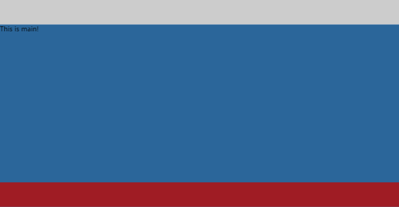
<!DOCTYPE html>
<html lang="en">
<head>
    <meta charset="UTF-8">
    <title>头部,尾部高度固定,中间自适应布局</title>
    <style>
        * { padding: 0;margin: 0;}
        header { width: 100%; height: 60px; background: #cccccc;}
        main { width: 100%; background: #2b669a;position: absolute;top: 60px;bottom: 60px;}
        footer {width: 100%;height:60px;background: #9f1c24; position: absolute;bottom: 0;}
    </style>
</head>
<body>
<header></header>
<main>This is main!</main>
<footer></footer>
</body>
</html>
5. 见下图:
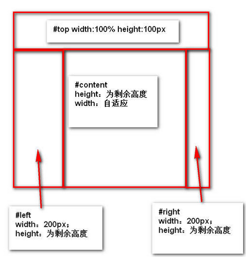
效果:
代码:
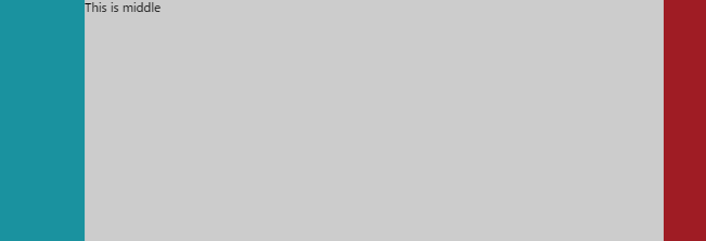
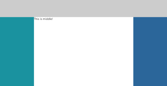
<!DOCTYPE html>
<html lang="en">
<head>
    <meta charset="UTF-8">
    <title>header-fixed-else-3-cols</title>
    <style>
        html,body { padding: 0;margin: 0;height: 100%;width: 100%;}
        header { width: 100%; height: 100px; background: #cccccc;}
        /*main { height: 100%;margin-top: -60px; width: 100%;}*/
        .left { width: 200px; position: absolute; top: 100px; bottom: 0;background: #1a929f;}
        .middle { position: absolute; left: 200px;right: 200px;top: 100px;bottom: 0;}
        .right { width: 200px;position: absolute; top: 100px; right: 0;bottom: 0; background: #2b669a;}
    </style>
</head>
<body>
<header></header>
<main>
    <section class="left"></section>
    <section class="middle">This is middle!</section>
    <section class="right"></section>
</main>
</body>
</html>
相关链接:常见的CSS布局总结
6.实现垂直居中水平居中的绝对定位居中技术
我们经常用 margin:0 auto来实现水平居中,而一直认为margin:auto不能实现垂直居中……实际上,实现垂直居中仅需要声明元素高度和下面的CSS:
.Absolute-Center {
  margin: auto;
  position: absolute;
  top: 0; left: 0; bottom: 0; right: 0;
}
优点:
1.支持跨浏览器,包括IE8-IE10.
2.无需其他特殊标记,CSS代码量少
3.支持百分比%属性值和min-/max-属性
4.只用这一个类可实现任何内容块居中
5.不论是否设置padding都可居中(在不使用box-sizing属性的前提下)
6.内容块可以被重绘。
7.完美支持图片居中。
缺点:
1.必须声明高度(查看可变高度Variable Height)。
2.建议设置overflow:auto来防止内容越界溢出。(查看溢出Overflow)。
3.在Windows Phone设备上不起作用。
浏览器兼容性:
Chrome,Firefox, Safari, Mobile Safari, IE8-10.
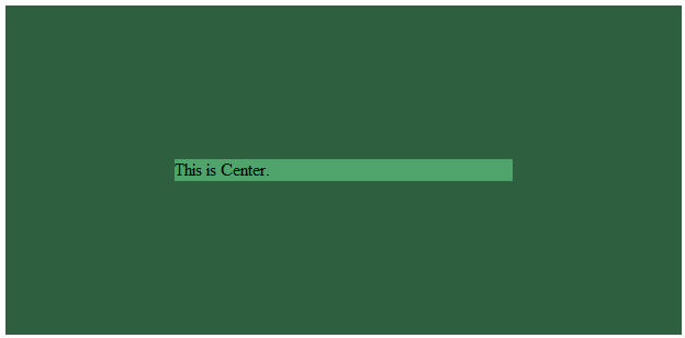
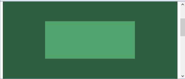
a.容器内(Within Container)
内容块的父容器设置为position:relative,使用上述绝对居中方式,可以使内容居中显示于父容器()。
显示效果:

HTML代码:
<div class="container">
    <div class="center"></div>
</div>
CSS代码:
.container { background: #2E5F3F;position: relative; height: 300px;}
.center { margin: auto;position: absolute;top: 0; left: 0; bottom: 0; right: 0;}
.center { background: #4FA46B; ;width: 50%;height: 120px; }
源码:absolute-centering-in-css-01.html
b.视区内(Within Viewport)
想让内容块一直停留在可视区域内?将内容块设置为position:fixed;并设置一个较大的z-index层叠属性值。
.center.is-Fixed {position: fixed;z-index: 9999;}
显示效果:
源码:absolute-centering-in-css-02.html
c.边栏 (Offsets)
如果你要设置一个固顶的头或增加其他的边栏,只需要在内容块的样式中加入像这样的CSS样式代码:top:70px;bottom:auto;由于已经声明了margin:auto;,该内容块将会垂直居中于你通过top,left,bottom和right属性定义的边界框内。
你可以将内容块固定与屏幕的左侧或右侧,并且保持内容块垂直居中。使用right:0;left:auto;固定于屏幕右侧,使用left:0;right:auto;固定与屏幕左侧。
.center.is-Left { right:auto; left: 0;text-align: left; width: 40%;}
.center.is-Right { left:auto; right: 0;text-align: right; width: 40%;}
显示效果:

源码:absolute-centering-in-css-03.html
d.响应式(Responsive)
绝对居中最大的优势应该就是对百分比形式的宽高支持的非常完美。甚至min-width/max-width 和min-height/max-height这些属性在自适应盒子内的表现也和预期很一致。
.center.is-Responsive { width: 60%;height: 60%;min-width: 200px;max-width: 400px;padding: 40px;}
源码:absolute-centering-in-css-04.html
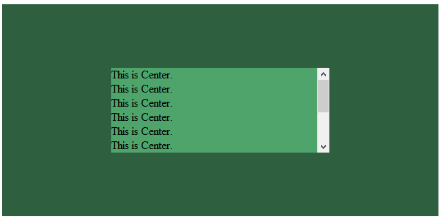
e.溢出情况(Overflow)
内容高度大于块元素或容器(视区viewport或设为position:relative的父容器)会溢出,这时内容可能会显示到块与容器的外面,或者被截断出现显示不全(分别对应内容块overflow属性设置为visible和hidden的表现)。
加上overflow: auto会在内容高度超过容器高度的情况下给内容块显示滚动条而不越界。
.center.is-Overflow { overflow: auto; }
源码:absolute-centering-in-css-05.html
f.重绘(Resizing)
你可以使用其他class类或JavaScript代码来重绘内容块同时保证居中,无须手动重新计算中心尺寸。当然,你也可以添加resize属性来让用户拖拽实现内容块的重绘。
绝对居中(Absolute Centering)可以保证内容块始终居中,无论内容块是否重绘。可以通过设置min-/max-来根据自己需要限制内容块的大小,并防止内容溢出窗口/容器。
.center.is-Resizable {min-width: 20%;max-width: 80%;min-height: 20%;max-height: 80%;resize: both;overflow: auto;}
源码:absolute-centering-in-css-06.html
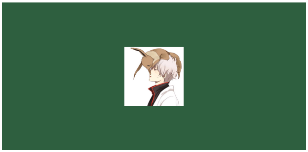
g.图片(Images)
绝对居中(AbsoluteCentering)也适用于图片。
源码:absolute-centering-in-css-07.html
h.可变高度(Variable Height)
这种情况下实现绝对居中(AbsoluteCentering)必须要声明一个高度,不管你是基于百分比的高度还是通过max-height控制的高度,还有,别忘了设置合适的overflow属性。对自适应/响应式情景,这种方法很不错。
与声明高度效果相同的另一种方法是设置display:table;这样无论实际内容有多高,内容块都会保持居中。
.center.is-Variable { display: table; height: auto;}