上次做了个很酷的不规则窗体,这次我们来弄点好看的按钮出来,此次将采用纯代码来设计按钮样式,不需要 Microsoft Expression Design 辅助了。
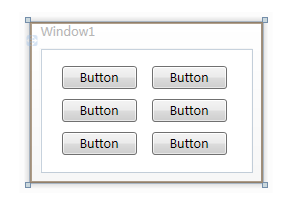
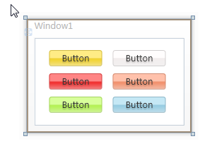
首先打开 Microsoft Visual Studio 2008 ,新建一个WPF项目,在上面随便放几个按钮:
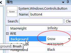
然后给各个按钮设置不同的背景颜色:
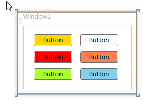
设置好之后就是这样啦:
然后我们就开始在 App.xaml 文件中定义按钮样式了:
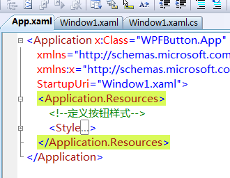
定义的样式代码如下:
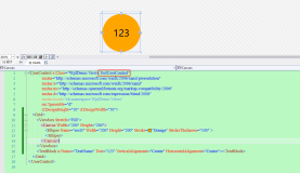
 Code
Code
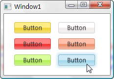
看了先不要头大,我们先看看最终效果,然后回过头来再解释代码:
这是常规样式
这个是鼠标移到上面时的样式

这个是鼠标点击时的样式
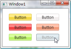
还有就是按钮失效时的样式
效果还算不错吧,下面来讲解代码喽,头晕的同学可以现在就收拾东西回家了哈。
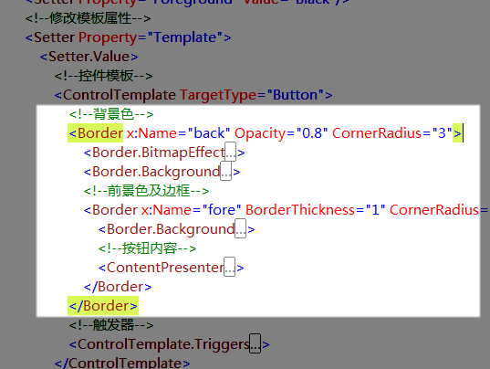
我们先来看这个命名为“back”的 Border 元素,它用它的 Background 属性充当了整个按钮的背景色。
 <
Border.Background
>
<
LinearGradientBrush
StartPoint
="0,0"
EndPoint
="0,1.5"
>
<
GradientBrush.GradientStops
>
<
GradientStopCollection
>
<
GradientStop
Color
="
{Binding RelativeSource={RelativeSource TemplatedParent}, Path=(Button.Background).(SolidColorBrush.Color)}
"
Offset
="0"
/>
<
GradientStop
Color
="
{Binding RelativeSource={RelativeSource TemplatedParent}, Path=(Button.Background).(SolidColorBrush.Color)}
"
Offset
="0.4"
/>
<
GradientStop
Color
="#FFF"
Offset
="1"
/>
</
GradientStopCollection
>
</
GradientBrush.GradientStops
>
</
LinearGradientBrush
>
</
Border.Background
>
<
Border.Background
>
<
LinearGradientBrush
StartPoint
="0,0"
EndPoint
="0,1.5"
>
<
GradientBrush.GradientStops
>
<
GradientStopCollection
>
<
GradientStop
Color
="
{Binding RelativeSource={RelativeSource TemplatedParent}, Path=(Button.Background).(SolidColorBrush.Color)}
"
Offset
="0"
/>
<
GradientStop
Color
="
{Binding RelativeSource={RelativeSource TemplatedParent}, Path=(Button.Background).(SolidColorBrush.Color)}
"
Offset
="0.4"
/>
<
GradientStop
Color
="#FFF"
Offset
="1"
/>
</
GradientStopCollection
>
</
GradientBrush.GradientStops
>
</
LinearGradientBrush
>
</
Border.Background
>
其背景所用的是一个渐变笔刷,起始值和中间值都是引用的按钮本身的背景色,就是我们之前设置过的颜色啦,终止值是白色,这样通过位置调整,我们可以在按钮最下部产生一些向白色的过度色彩效果。
<
Border.BitmapEffect
>
<
OuterGlowBitmapEffect
Opacity
="0.7"
GlowSize
="0"
GlowColor
="
{Binding RelativeSource={RelativeSource TemplatedParent}, Path=(Button.Background).(SolidColorBrush.Color)}
"
/>
</
Border.BitmapEffect
>
它的 BitmapEffect 属性我们设置了一个大小为 0 的外发光效果,平常是看不见这效果的,在这里预先设置好,是为了在鼠标移入、按下时实现动画使用。
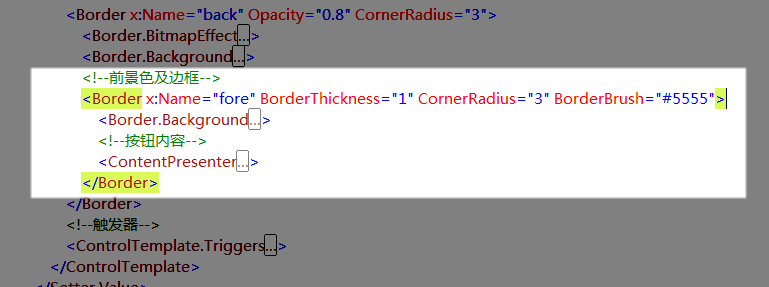
再来看看这个命名为“fore”的 Border 元素,它实现的是按钮的边框和高亮反光效果,我为它设置了一个半透明的黑色1像素边框,使得这个边框的色彩可以和背景色混合起来。
<
Border.Background
>
<
LinearGradientBrush
StartPoint
="0,0"
EndPoint
="0,1"
>
<
GradientBrush.GradientStops
>
<
GradientStopCollection
>
<
GradientStop
Color
="#6FFF"
Offset
="0.5"
/>
<
GradientStop
Color
="#1111"
Offset
="0.51"
/>
</
GradientStopCollection
>
</
GradientBrush.GradientStops
>
</
LinearGradientBrush
>
</
Border.Background
>
它的背景同样采用的渐变笔刷,起始值和终止值的位置几乎贴在一起,从而形成比较鲜明的反光度对比。
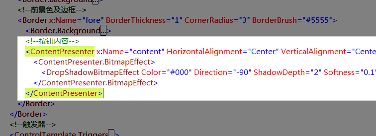
ContentPresenter 元素用于呈现按钮原本的内容,对于按钮来说就是按钮上的文字了,当然也可能会存在图片或其它东西。
<
ContentPresenter.BitmapEffect
>
<
DropShadowBitmapEffect
Color
="#000"
Direction
="-90"
ShadowDepth
="2"
Softness
="0.1"
Opacity
="0.3"
/>
</
ContentPresenter.BitmapEffect
>
我为之加了一个不太明显的阴影滤镜以增强显示效果。
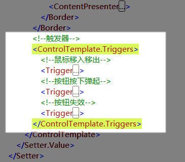
剩下的就是些可爱又该死的 Trigger ,我们通过这些触发器来改变按钮在不同状态时的外观。
<!--
鼠标移入移出
-->
<
Trigger
Property
="IsMouseOver"
Value
="True"
>
<
Trigger.EnterActions
>
<
BeginStoryboard
>
<
Storyboard
>
<
DoubleAnimation
To
="6"
Duration
="0:0:0.2"
Storyboard.TargetName
="back"
Storyboard.TargetProperty
="(Border.BitmapEffect).(OuterGlowBitmapEffect.GlowSize)"
/>
<
ColorAnimation
To
="#AFFF"
BeginTime
="0:0:0.2"
Duration
="0:0:0.2"
Storyboard.TargetName
="fore"
Storyboard.TargetProperty
="(Border.Background).(LinearGradientBrush.GradientStops)[0].(GradientStop.Color)"
/>
<
ColorAnimation
To
="#3FFF"
BeginTime
="0:0:0.2"
Duration
="0:0:0.2"
Storyboard.TargetName
="fore"
Storyboard.TargetProperty
="(Border.Background).(LinearGradientBrush.GradientStops)[1].(GradientStop.Color)"
/>
</
Storyboard
>
</
BeginStoryboard
>
</
Trigger.EnterActions
>
<
Trigger.ExitActions
>
<
BeginStoryboard
>
<
Storyboard
>
<
DoubleAnimation
Duration
="0:0:0.2"
Storyboard.TargetName
="back"
Storyboard.TargetProperty
="(Border.BitmapEffect).(OuterGlowBitmapEffect.GlowSize)"
/>
<
ColorAnimation
Duration
="0:0:0.2"
Storyboard.TargetName
="fore"
Storyboard.TargetProperty
="(Border.Background).(LinearGradientBrush.GradientStops)[0].(GradientStop.Color)"
/>
<
ColorAnimation
Duration
="0:0:0.2"
Storyboard.TargetName
="fore"
Storyboard.TargetProperty
="(Border.Background).(LinearGradientBrush.GradientStops)[1].(GradientStop.Color)"
/>
</
Storyboard
>
</
BeginStoryboard
>
</
Trigger.ExitActions
>
</
Trigger
>
在鼠标移入按钮时,我依次创建了改变外发光效果大小、改变上部反光区域颜色、改变下部反光区域颜色的动画,这里的要点就在于“Storyboard.TargetProperty="(Border.Background).(LinearGradientBrush.GradientStops)[1].(GradientStop.Color)"”属性设置语句,琢磨一下你就能看出这是对属性路径的描述,只不过它们写起来和看起来都很让人生气。
<!--
按钮按下弹起
-->
<
Trigger
Property
="IsPressed"
Value
="True"
>
<
Trigger.EnterActions
>
<
BeginStoryboard
>
<
Storyboard
>
<
DoubleAnimation
To
="3"
Duration
="0:0:0.1"
Storyboard.TargetName
="back"
Storyboard.TargetProperty
="(Border.BitmapEffect).(OuterGlowBitmapEffect.GlowSize)"
/>
<
ColorAnimation
To
="#3AAA"
Duration
="0:0:0.1"
Storyboard.TargetName
="fore"
Storyboard.TargetProperty
="(Border.Background).(LinearGradientBrush.GradientStops)[0].(GradientStop.Color)"
/>
<
ColorAnimation
To
="#2111"
Duration
="0:0:0.1"
Storyboard.TargetName
="fore"
Storyboard.TargetProperty
="(Border.Background).(LinearGradientBrush.GradientStops)[1].(GradientStop.Color)"
/>
</
Storyboard
>
</
BeginStoryboard
>
</
Trigger.EnterActions
>
<
Trigger.ExitActions
>
<
BeginStoryboard
>
<
Storyboard
>
<
DoubleAnimation
Duration
="0:0:0.1"
Storyboard.TargetName
="back"
Storyboard.TargetProperty
="(Border.BitmapEffect).(OuterGlowBitmapEffect.GlowSize)"
/>
<
ColorAnimation
Duration
="0:0:0.1"
Storyboard.TargetName
="fore"
Storyboard.TargetProperty
="(Border.Background).(LinearGradientBrush.GradientStops)[0].(GradientStop.Color)"
/>
<
ColorAnimation
Duration
="0:0:0.1"
Storyboard.TargetName
="fore"
Storyboard.TargetProperty
="(Border.Background).(LinearGradientBrush.GradientStops)[1].(GradientStop.Color)"
/>
</
Storyboard
>
</
BeginStoryboard
>
</
Trigger.ExitActions
>
</
Trigger
>
按下和弹起按钮时,我们做了相似的动画改变,与前面相比只是数值略微不同。
<!--
按钮失效
-->
<
Trigger
Property
="IsEnabled"
Value
="False"
>
<
Setter
Property
="Foreground"
Value
="#B444"
/>
<
Trigger.EnterActions
>
<
BeginStoryboard
>
<
Storyboard
>
<
DoubleAnimation
To
="0"
Duration
="0:0:0.3"
Storyboard.TargetName
="back"
Storyboard.TargetProperty
="(Border.BitmapEffect).(OuterGlowBitmapEffect.GlowSize)"
/>
<
DoubleAnimation
To
="1"
Duration
="0:0:0.1"
Storyboard.TargetName
="content"
Storyboard.TargetProperty
="(ContentPresenter.BitmapEffect).(DropShadowBitmapEffect.Opacity)"
/>
<
DoubleAnimation
To
="-135"
Duration
="0:0:0.1"
Storyboard.TargetName
="content"
Storyboard.TargetProperty
="(ContentPresenter.BitmapEffect).(DropShadowBitmapEffect.Direction)"
/>
<
ColorAnimation
To
="#FFF"
Duration
="0:0:0.3"
Storyboard.TargetName
="content"
Storyboard.TargetProperty
="(ContentPresenter.BitmapEffect).(DropShadowBitmapEffect.Color)"
/>
<
ColorAnimation
To
="#D555"
Duration
="0:0:0.3"
Storyboard.TargetName
="fore"
Storyboard.TargetProperty
="(Border.BorderBrush).(SolidColorBrush.Color)"
/>
<
ColorAnimation
To
="#CEEE"
Duration
="0:0:0.3"
Storyboard.TargetName
="fore"
Storyboard.TargetProperty
="(Border.Background).(LinearGradientBrush.GradientStops)[0].(GradientStop.Color)"
/>
<
ColorAnimation
To
="#CDDD"
Duration
="0:0:0.3"
Storyboard.TargetName
="fore"
Storyboard.TargetProperty
="(Border.Background).(LinearGradientBrush.GradientStops)[1].(GradientStop.Color)"
/>
</
Storyboard
>
</
BeginStoryboard
>
</
Trigger.EnterActions
>
<
Trigger.ExitActions
>
<
BeginStoryboard
>
<
Storyboard
>
<
DoubleAnimation
Duration
="0:0:0.1"
Storyboard.TargetName
="back"
Storyboard.TargetProperty
="(Border.BitmapEffect).(OuterGlowBitmapEffect.GlowSize)"
/>
<
DoubleAnimation
Duration
="0:0:0.1"
Storyboard.TargetName
="content"
Storyboard.TargetProperty
="(ContentPresenter.BitmapEffect).(DropShadowBitmapEffect.Opacity)"
/>
<
DoubleAnimation
Duration
="0:0:0.1"
Storyboard.TargetName
="content"
Storyboard.TargetProperty
="(ContentPresenter.BitmapEffect).(DropShadowBitmapEffect.Direction)"
/>
<
ColorAnimation
Duration
="0:0:0.1"
Storyboard.TargetName
="content"
Storyboard.TargetProperty
="(ContentPresenter.BitmapEffect).(DropShadowBitmapEffect.Color)"
/>
<
ColorAnimation
Duration
="0:0:0.1"
Storyboard.TargetName
="fore"
Storyboard.TargetProperty
="(Border.BorderBrush).(SolidColorBrush.Color)"
/>
<
ColorAnimation
Duration
="0:0:0.1"
Storyboard.TargetName
="fore"
Storyboard.TargetProperty
="(Border.Background).(LinearGradientBrush.GradientStops)[0].(GradientStop.Color)"
/>
<
ColorAnimation
Duration
="0:0:0.1"
Storyboard.TargetName
="fore"
Storyboard.TargetProperty
="(Border.Background).(LinearGradientBrush.GradientStops)[1].(GradientStop.Color)"
/>
</
Storyboard
>
</
BeginStoryboard
>
</
Trigger.ExitActions
>
</
Trigger
>
当按钮失效时,我要改变很多东西,首先将文字颜色设为灰色,然后依次创建了改变外发光效果大小、改变内容阴影效果不透明度、改变内容阴影效果角度、改变内容阴影效果颜色、改变按钮边框颜色、改变上部反光区域颜色、改变下部反光区域颜色的动画。
这里将先前对内容应用的阴影效果彻底改变,使之产生凹陷的效果。
好了,到这里就下课啦,文章有点冗长了,但应该对新手很有帮助,老鸟估计现在已经梦游仙境了吧。
本文转自斯克迪亚博客园博客,原文链接:http://www.cnblogs.com/SkyD/archive/2008/07/15/1243043.html,如需转载请自行联系原作者