带平行视差效果的星星
先看效果:
如果下方未出现效果也可前往这里查看 http://sandbox.runjs.cn/show/0lz3sl9y
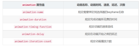
下面我们利用CSS3的animation写出这样的动画来,要点就是:
- 用动画不停改变背景图片位置;
- 动画高为无限循环;
在页面放三个DIV,首先将他们大小铺满整个窗口,这点是通过将其position设为absolute然后分别设置上左下右四个方面距离为0px达到的。
<!doctype html>
<html>
    <head>
        <title>Moving stars</title>
        <style type="text/css">
        	html,body{
        	        margin: 0;
        	}
	        .wall{
		        position: absolute;
		        top: 0;
		        left: 0;
		        bottom: 0;
		        right: 0;
	        }
	        div#background{
	        	background: black url('img/background.png') repeat-x 5% 0%;
	        }
	        div#midground{
		        background:url('img/midground.png')repeat 20% 0%;
		        z-index: 1;
	        }
	        div#foreground{
		        background:url('img/foreground.png')repeat 35% 0%;
		        z-index: 2;
	        }
        </style>
    </head>
    <body>
        <div id="background" class="wall"></div>
        <div id="midground" class="wall"></div>
        <div id="foreground" class="wall"></div>
    </body>
</html>
然后定义的们的动画,让背景图片的位置从开始的0%变化到600%,注意我们只改变x方向的位置,y保持0%不变,因为我们想要的效果是水平移动,所以y方向无变化。
@-webkit-keyframes STAR-MOVE {
	from {
		background-position:0% 0%
	}
	to {
		background-position: 600% 0%
	}
}
@keyframes STAR-MOVE {
	from {
		background-position: 0% 0%
	}
	to {
		background-position: 600% 0%
	}
}
最后一步便是将动画关键帧应用到三个充当背景的DIV上。
div#background {
    background: black url('img/background.png') repeat-x 5% 0%;
    -webkit-animation: STAR-MOVE 200s linear infinite;
    -moz-animation: STAR-MOVE 200s linear infinite;
    -ms-animation: STAR-MOVE 200s linear infinite;
    animation: STAR-MOVE 200s linear infinite;
}
div#midground {
    background: url('img/midground.png')repeat 20% 0%;
    z-index: 1;
    -webkit-animation: STAR-MOVE 100s linear infinite;
    -moz-animation: STAR-MOVE 100s linear infinite;
    -ms-animation: STAR-MOVE 100s linear infinite;
    animation: STAR-MOVE 100s linear infinite;
}
div#foreground {
    background: url('img/foreground.png')repeat 35% 0%;
    z-index: 2;
    -webkit-animation: STAR-MOVE 50s linear infinite;
    -moz-animation: STAR-MOVE 50s linear infinite;
    -ms-animation: STAR-MOVE 50s linear infinite;
    animation: STAR-MOVE 50s linear infinite;
}
飘动的浮云
如果把上面的星星图片换成云彩,那就成了飘动的浮云了。
代码需要小的改动,就是背景层需要设置background-size为cover,这样才能让蓝天铺满窗口。
div#background {
    background: black url('img/background.png') repeat-x 5% 0%;
    background-size: cover;
    -webkit-animation: STAR-MOVE 200s linear infinite;
    -moz-animation: STAR-MOVE 200s linear infinite;
    -ms-animation: STAR-MOVE 200s linear infinite;
    animation: STAR-MOVE 200s linear infinite;
}
下面嵌入的貌似效果不太好,还是打开链接全屏查看吧,http://sandbox.runjs.cn/show/zgvynqhj。
代码下载
度娘盘:http://pan.baidu.com/s/1sj0KHmX
REFERENCE
http://css-tricks.com/examples/StarryNightCSS3/
http://www.techumber.com/2013/12/amazing-glitter-star-effect-using-pure-css3.html