Semantic-UI官方的React组件化已经快要接近完成了,最近开放了官网:http://react.semantic-ui.com/。从官网看,基本组件已经基本完备,还有几个Addon也在进行中。
基本元素组件
Semantic-UI中的基本元素均为纯CSS类定义的组件,没有js的操作,因此实现起来比较简单。有了前面基础类UiElement和辅助类PropsHelper的实现,要实现一个基本元素组件非常轻松。
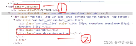
以Button组件举例。Button组件可以单独存在,也可以作为组组件使用。另外Button组件也允许简单的Animation存在,即一对显示/隐藏的组件可以随鼠标状态而切换。外部调用的大致形式为:
- <Button.Group size='small'>
- <Button primary onClick={this.handleClickBtn1}>按键1</Button>
- <Button color='blue' onClick={this.handleClickBtn2}>按键2</Button>
- <Button animated onClick={this.handleClickBtn3}>
- <Button.Content visible>按键3显示内容</Button>
- <Button.Content hidden>按键3隐藏内容</Button>
- </Button>
- </Button.Group>
调用方式实际上是很直观的,属性均作为props传入到Button组件中,事件系统的回调方法也与普通方式并无二致。相对复杂的处理,是要整理所有组件的共通属性,定义它们的类型和取值范围。
Button
Button作为基本组件,有非常多常用的属性。这些属性在命名上,基本参照Semantic-UI的原有CSS类名,在Button.js中用常量PROP_TYPES来定义。
- const PROP_TYPES = [
- 'primary', 'secondary', 'animated', 'labeled', 'basic', 'inverted', 'color',
- 'size', 'fluid', 'active', 'disabled', 'loading', 'compact', 'circular', 'positive',
- 'negative', 'floated', 'attached', 'iconed', 'dropdown'
- ];
组件根据PropsHelper的相关方法来生成propTypes定义,并且通过父类(UiElement)的createElementStyle方法来编辑和组装所使用的CSS类。另外,还通过父类的getEventCallback方法,来声明相关的事件系统回调处理。
- class Button extends UiElement {
- // 类型定义
- static propTypes = {
- ...PropsHelper.createPropTypes(PROP_TYPES)
- };
- render() {
- // 生成元素style
- let style = this.createElementStyle(this.props, PROP_TYPES, 'button');
- return (
- <div id={this.props.id} className={style} {...this.getEventCallback()} tabIndex='0'>
- {this.props.children}
- </div>
- );
- }
- }
Button.Group
与Button组件类似,Group组件也继承于UiElement以生成其声明的公有属性对应的CSS类。
- // 属性定义
- const GROUP_PROP_TYPES = [
- 'iconed', 'vertical', 'labeled', 'equalWidth', 'color',
- ];
- /**
- * 按键组组件
- */
- class Group extends UiElement {
- // 类型定义
- static propTypes = {
- ...PropsHelper.createPropTypes(GROUP_PROP_TYPES)
- };
- /**
- * 取得渲染内容
- */
- render() {
- // 生成元素Style
- let style = this.createElementStyle(this.props, PROP_TYPES, 'buttons');
- return (
- <div id={this.props.id} className={style} {...this.getEventCallback()}>
- {this.props.children}
- </div>
- );
- }
- }
Button.Content
Content组件的实现更简单,直接贴代码。
- class Content extends React.Component {
- static propTypes = {
- visible: React.PropTypes.bool
- };
- render() {
- return (
- <div className={this.props.visible ? 'visible content' : 'hidden content'}>
- {this.props.children}
- </div>
- )
- }
- }
其他组件
通过以上示例可以看出,有了UiElement和PropsHelper类的处理,基本元素组件的实现是非常简单的。只需声明组件所使用的属性,并使用父类方法编辑和组装CSS类即可。其他组件如Label,Icon,Image,Grid等,均沿同一思路封装即可完成。
难点是什么?
在封装基本元素组件的过程中,我感觉难点在于:
- 封装和抽象元素的共通处理(目前已基本成型)
- 管理众多组件的共通属性(目前还在摸索中)
看过官方相关处理的源码,感觉思路还是大体一致的,这点让我感觉多了一些自信(๑•̀ㅂ•́)و
作者:sheva
来源:51CTO